menu


Methodology Q&A |
What is behavioural psychology & why is it important?
The difference between product designers and engineers is that the former will design when there is human decision-making involved, the latter will design when there isn’t. For example, when an engine needs to work with a gearbox, engineers are needed and when that same car maker needs to design a car desirable enough for people to part with a year's salary to obtain it, product designers are needed. Product design is a social science, engineering is a hard science. An engineer won’t need to be able to understand behavioural psychology in the same way the product designer won’t need to learn algebra or logic. What’s so interesting about the introduction of CRO (Conversion Rate Optimisation) into the design process is that it’s a place where the lines between hard and soft science become blurred. Since hard sciences are defined by the use of the scientific method using experiments to test theories, observing and measuring, which is precisely what CRO is all about.
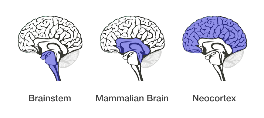
So let’s look at human decision-making, where does it come from? In evolutionary psychology, there’s a theory called the triune brain theory, that says our brain evolved in three stages. The first part is the brain stem, the smallest part at the bottom of the brain responsible for keeping our hearts going, our bloodflow, our breathing, digestion, all the circulation, all the things we can’t consciously control. The next part is called the mammalian brain, similar to the brain of an animal. Finally, the neocortex, which covers up everything (the word cortex literally means ‘cover’).
The most important part of the brain to understand as a product designer is that animal brain. Something very similar to what’s inside the head of an animal, imagine a dog. One thing that’s absolutely certain is that the mammalian part of the brain doesn’t comprehend language at all or words but it’s where our decision-making comes from. So how do we talk to or communicate with this part of the brain without using language? This is the part of the brain that drives our emotions and behaviour and identifies something we really like. For example, a potential sexual partner, but it doesn’t use words to identify that, instead it works off of powerful imagery, pain, fear and reward. So how do product designers convey a message or communicate with this animal? They use design language where the skill in the art is to efficiently and effectively communicate with the animal brain that drives our decision-making - products and services have to do things that are visual and emotional in order to be optimal.
When your brain thinks that something is really important to you, it looks all over the place for it. Think of the last time you bought a car when you were looking to buy one particular model. When you then drove around, all you could see was that exact make and model car. It wasn’t that people started going out and buying this car a lot when you did, it was that you just started noticing them because your brain somehow thought that this is important, so it’s going to start looking for it everywhere you go. This is called the reticular activating system. It’s basically a focus flashlight. This is really important for product designers to understand because if their task is to be able to design the most desirable products and services in the world - ultimately measured via human decision-making - we need to know what humans find desirable in the first place and how. This is why we have the design process - to discover and define what particular groups of people find the most desirable (emotionally and visually stimulating) within the limits of the business and the technology.
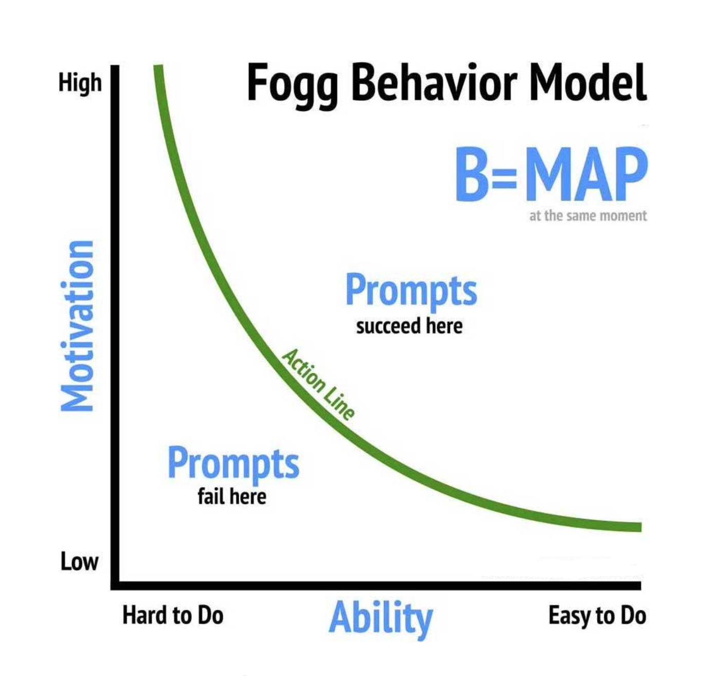
A good place to begin looking at behavioural psychology is the BJ Fogg Behaviour Model. As this really does underpin all products and services. It shows that three elements must converge at the same moment for a behaviour to occur: Motivation, Ability, and a Prompt (also known as a ‘trigger’). You can plot entire products and services here or a particular step, feature or interaction. It shows an X and Y axis, where the X is the scale of how easy something is to do, and the Y is the scale of how motivated people are to do it. The third element (promt) is shown as a green inverted curve spanning from the highest motivation to easiest to do.
The aim of product design is to design triggers and prompts so they can be plotted in the upper right area of this model. For example, it’s okay if something is hard to do as there might be a good reason for it. Think Bloomberg Terminal. It’s hard for traders to use when they start their career, but their motivation to learn and use that platform is high, which would be plotted in the top left corner, to the right of the green action line. Another example would be an iPad app for a toddler or small child. The app would be easy for them to use and their motivation to use it would also be high, which would be plotted in the top right corner of the model, and so on. You need to make sure that what you design and build is quite literally going to get you over the line...the green line.
To truly optimise the customer experience and enhance product performance, it's crucial to understand the fundamental cognitive biases and psychological principles that drive human decision-making. At a granular level, these insights help shape interactions that feel intuitive, engaging, and persuasive. In modern products and services, game mechanics are increasingly being leveraged to influence behaviour, extending beyond traditional loyalty programs to redefine how engagement and retention strategies are designed. However, with these advancements comes the risk of ethical pitfalls, some teams may be tempted to implement dark patterns to achieve business goals without first laying a solid foundation. By grounding design decisions in behavioural psychology rather than manipulation, teams can create experiences that are both effective and ethically sound.
Below are some of the most commonly applied cognitive biases and psychological principles that CRO specialists and product designers use to drive optimisation.
- Filtering the information: (1) Hick’s law, Progressive Disclosure, Tesler’s Law, Cognitive Load, and Decision Fatigue: More options lead to harder decisions; people can end up making the wrong decision or experience decision paralysis and make no decision at all; (2) Priming, Framing Effect, and Anchoring Bias: Previous information influences perception and decisions; (3) Banner Blindness: Automatically ignoring low-value elements or content after repeated exposure; (4) Expectation Gap and Expectations Bias: Influencing your own decisions using your own expectations; (5) Visual Anchors, Signals & Noise: A high-value element is used to lead people through a customer journey, and any elements that do not complement this are considered noise; (6) Law of Proximity: Elements close to each other are usually considered related; (7) Spark Effect: The likelihood to engage increases when there is little effort needed; (8) Aesthetic-Usability Effect: Perceived ease of use increases with improved aesthetics.
- Seeking the meaning of it: (1) Social Proof/Bandwagon Effect: Adapting behaviors based on what others do; (2) Scarcity: People value things more when they're in limited supply; (3) Authority Bias/Halo Effect/Observer-Expectancy Effect: Trust in information increases when given by an authority figure; (4) Curiosity Gap: Desire to seek out missing information; (5) Mental Model/Familiarity Bias/External & Internal Consistency: Expecting something to work in a certain way if it’s already in use somewhere else; (6) Variable Reward/Surprise Reward/Delighters: Unexpected treats are enjoyed and remembered more; (7) Goal Gradient Effect: Motivation increases the closer someone gets to their goal; (8) Occam’s Razor: Simplicity is preferred over complexity; (9) Noble Edge Effect: Trust and respect increase with companies that demonstrate social responsibility; (10) Miller’s Law: On average, people keep 7±2 items in their working memory; (11) Flow State: Full immersion and focus on a particular task; (12) Curse of Knowledge: Unaware that others do not understand or share the same knowledge; (13) Survey Bias: Changing answers or views based on what is socially acceptable; (14) Cognitive Dissonance: Opposing ideas to our own are more easily forgotten; (15) Feedforward: Knowing what’s to come before taking an action to find out; (16) Streisand Effect: Awareness increases after censorship aimed at decreasing awareness; (17) Fresh Start Effect: Likelihood to take action increases if there is a feeling of new beginnings.
- Acting within a given time: (1) Labour Illusion: Perception of value increases when the methods used to design and build are known; (2) Default Bias: Established behaviors are harder to change; (3) Investment Loops: Likelihood to return increases once an investment has already been made; (4) Loss Aversion: The desire to avoid losses is greater than the desire to earn equivalent gains; (5) Reactance: Likelihood to adopt a new behavior decreases if forced upon someone; (6) Law of the Instrument: Over-reliance on familiar tools; (7) Temptation Bundling: Coupling a harder task with something desirable reduces fear of the harder task; (8) Dunning-Kruger Effect: When people who lack competence overestimate their competence; (9) Discoverability: Likelihood of being discovered or found; (10) Weber's Law: Adapting to smaller incremental changes is easier; (11) Hyperbolic Discounting: Immediate benefits are perceived as a higher priority than long-term gains; (12) Chronoception: Perception of time is subjective; (13) Cashless Effect: More money is spent when it cannot be seen; (14) Self-serving Bias: Taking credit for positive events, blaming others for negative events; (15) Pareto Principle: 80% of effects come from 20% of causes; (16) Backfire Effect: When convictions are challenged, beliefs get stronger; (17) False Consensus Effect: Overestimating how much other people agree with you; (18) Logical Fallacy: Arguments rendered invalid by a flaw in their logical structure; (19) IKEA Effect: Perceived value of an object increases if we helped to create it; (20) Planning Fallacy: Underestimating how long a task will take.
- Storing bits of the interaction in their memories: (1) Provide Exit Points: Encouraging users to disengage at the right moment; (2) Peak-End Rule: Experiences are judged by their peak and how they end; (3) Sensory Appeal: Engagement increases with things appealing to multiple senses; (4) Zeigarnik Effect: Incomplete tasks are easier to remember than completed ones; (5) Endowment Effect: Perceived value increases if something feels like it belongs to you; (6) Chunking: Grouped information is easier to remember; (7) Picture Superiority Effect: Pictures are easier to remember than words; (8) Method of Loci: Things associated with a location are easier to remember; (9) Shaping: Reinforcing actions to encourage a particular behavior; (10) Recognition Over Recall: Recognizing things is easier than recalling them from memory; (11) Storytelling Effect: Stories containing information are easier to remember than information alone; (12) Negativity Bias: Negative events are easier to recall than positive events; (13) Availability Heuristic: Relying on immediate information that comes to mind to make decisions; (14) Serial Position Effect: First and last items in a list are easiest to recall.
Being able to communicate to and with the animal brain, visually and emotionally, is the core skill shared by both the product designer and CRO specialist. It’s the reason why their disciplines exist. They combine hard and soft science to find out why people act the way they do, seeking to develop a specific product or service that people desire the most. Understanding human behaviour is our equal and equivalent of an engineer understanding algebra and logic - a skill set progressive societies cannot do without - helping to realise the belief in mankind's ability to improve our environment and the conditions of life.
Which KPI's are most important?
When starting a design-build project, it's crucial to focus on five key KPI categories from the outset. A common mistake among tech teams is considering them only at the end. Below are the five KPI categories, along with example metrics for each.
- Acquisition KPIs: (1) Sales sign-ups to web sign-ups ratio per week; (2) Landing page visitors per week; (3) Web sign-up button CTR per week; (4) Web sign-up CR per week; (5) Cost per customer acquisition ratio; (6) Ad impressions; (7) Growth rate: rate at which the app is acquiring new users; (8) Ad CTR.
- Engagement KPIs: (1) Daily active users (DAU); (2) Weekly active users (WAU); (3) Sessions per week; (4) Average session length; (5) Screen flow/popular features; (6) Mobile-to-desktop ratio; (7) Excel add-in to app ratio; (8) Market share.
- Retention KPIs: (1) Retention rate: % of users who return to the app after their first use; (2) Returning-to-new user ratio; (3) Churn rate: % of account deletions/inactivity.
- Virality KPIs: (1) New backlinks per week; (2) Number of ‘shares’ per week; (3) Viral coefficient/Referral rate: number of new users that each existing user is able to attract to the app/percentage of users who refer the app to others; (4) App/Play Store ranking/rating; (5) App/Play Store reviews per week; (6) Trustpilot score; (7) NPS: Detractors/passives/promoters' likelihood to recommend.
- Financial KPIs: (1) Spend per head per week (optional); (2) Spend per head increase per week; (3) Spend per company per week (optional); (4) Spend per company increase per week; (5) Spend frequency; (6) Upsells per week; (7) CLTV.
How do you work?
Every job is different and the more the software industry matures, the more of the design process we'll be able to carry out. But here is how it usually goes - an initial discovery phase (either on an existing product or a completely new one) defining pain points, opportunities, learning about and sharing knowledge of competition and the market > after collating and consolidating everything found in the discovery phase, we'll define what the exact problems we need to solve are > in the third phase, we will begin developing solutions, workshopping and evaluating all possibilities > in the final phase we will wireframe and validate to give us at least a hypothesis or at most an MVP. Once the product has been released, we can A/B test to capture a much broader spectrum of data that's more reliable and will help to refine the product once we feed what we learn back into the design process preparing for an optimised release-2.
How do you work within a team?
The teams I usually work with are made up of product owners, engineers, data scientists, analysts and various specialists. I work to build strong working relationships with everyone on the team as I don’t approach projects in a dictatorship kind of way but at the same time lead when I need to. I like to constantly communicate with team members as when everyone is working well together, that is when the good work is turned around quickly. See below for details of how I fit into an Agile team.
Did your education prepare you for what you're doing now?
While working as an automotive technician for Jaguar I had it drummed into me the importance of doing a job to a high standard quickly. Following that, my experience with car design taught me a lot about product design and the design process, as carmakers are people who get it right and get it right first time without a need for a second release or bug fixes. These are physical products that are expensive to buy, sell in high volume, are well known in the public domain and are still turned around very quickly which is due to how long teams have been making cars and, of course, how much money is in involved. Companies I work with can take advantage of some of the processes and philosophies used when carmakers make a car. I wrote an article on my experiences designing both cars and software for the technology and engineering consultancy BJSS.
What's new and upcoming in software design?
Blockchain, VR/AR, AI and quantum computing are four big step changes coming our way, aside from those, I’d say menuless or near menuless applications where the product is so efficient that there is no need for them anymore. We’ll see this first on native mobile apps, then it will be carried over into information dense web apps for desktop users. I see this more and more having worked with big data product suites and native mobile apps over the last few years - if people want to do something they don’t want to have to go to a menu to do it.
How do you gather user research?
I first check if any has been done before (at SymphonyAI a BA had done some great research that was nearly forgotten about). Then I carry out a discovery phase myself which should consist of: (1) Workshops - 18 people is ideal as this means I can do three 6-people workshops. These are great for getting a lot of reliable information in one go; (2) Interviews - the most common method as this can be done with anyone, anywhere at any time, I like to record interviews in a customer journey map format using UXPressia which can then be fed into a higher level service design blueprint format later, this method provides the most depth; (3) Surveys - less reliable on an individual basis but you get an unlimited amount of people taking them for you so you arrive at the truth in the sheer breadth of data you collect.
At the beginning of a contract, one of my priorities is to try and gather a list of: (1) People who 'Make' - the people who will have to actually make the product - engineers; (2) People who 'Buy' - where is the money going to come from/who will buy the product? Who are the people investing in this product and why are they investing in it?; (3) People who 'Use' - people who will use the product after we've made and released it (you may need to be a little proactive for this); (4) People who 'Know' - people who know about the product, competition and industry - client teams, sales teams, BAs etc. If you can resolve the arguments between these four sets of people then you will have a good product, the rest will come out of usability testing and then eventually A/B testing via release-1.
How do you carry out usability testing?
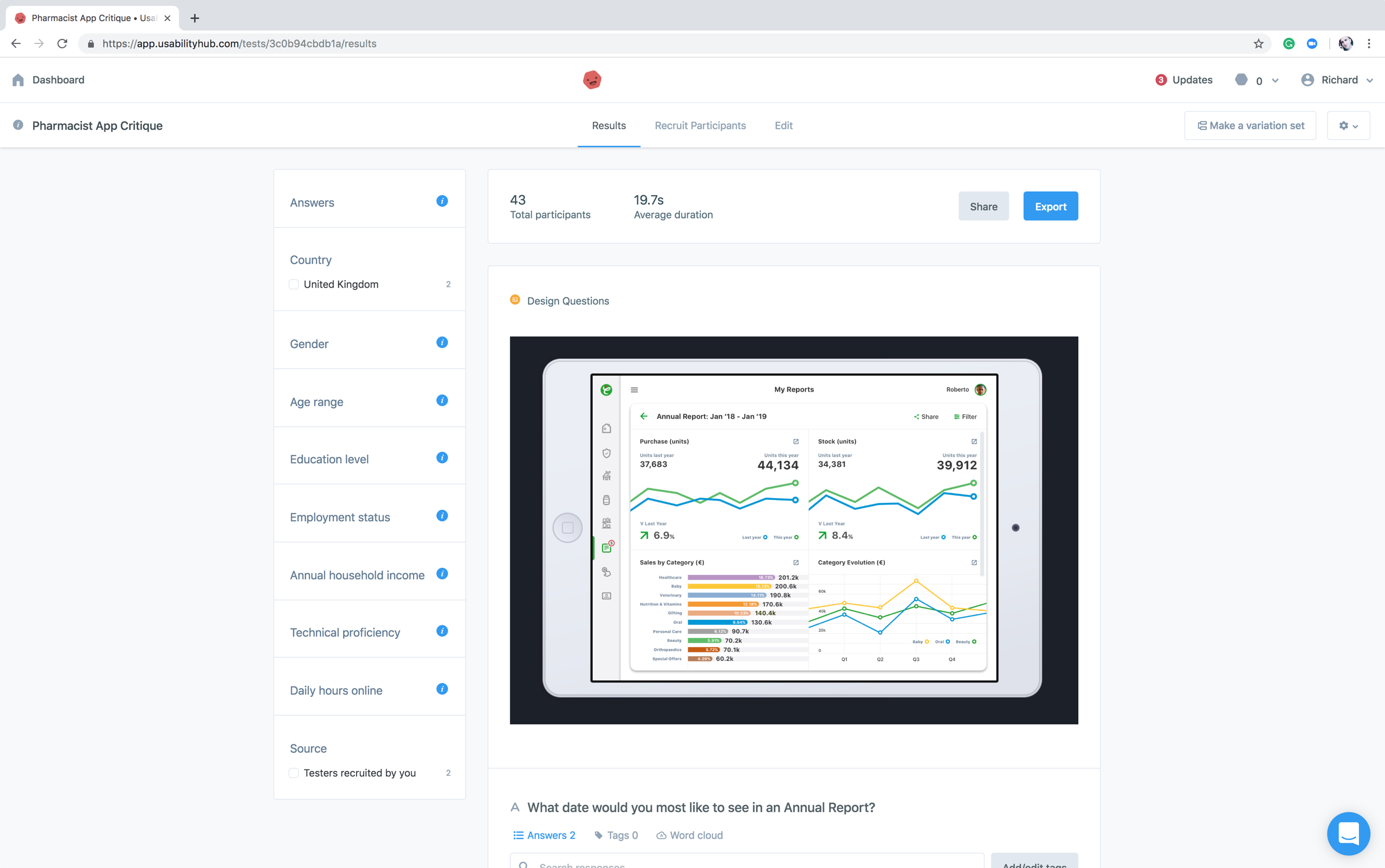
Testing can be carried out using in a number of ways but the more you can do the better it is. Testing tools include: (1) VWO/Optimizely/Optimize - industry standards for optimising websites and web apps by creating variations from within the app to A/B, multivariate test etc; (2) Inspectlet - simply records users' screen activity for you to analyse; (3) Usabilla - users can give live feedback on things they like and don’t like, very similar to the way you'd rate an app on the App Store, it's unobtrusive from a user POV and invaluable from a business POV; (4) Usabilityhub - five-second test, question test, click test, preference test, navigation test - a super simple tool to begin getting basic but important feedback; (5) UserZoom - measures all interactions and also records users' screen activity; (6) Hotjar - heatmaps, visitor recordings, conversion funnels, form analysis, feedback polls, surveys, recruit test users.
Examples of goals optimised during testing include: (1) Destination - a specific location loads e.g. a "Thank you for registering!" web page or app screen; (2) Duration - sessions that last a specific amount of time or longer e.g. 5 minutes or longer spent on an article page which would indicate consumption which would indicate that the content is of a certain quality; (3) Pages or Screens per session - a user views a specific number of pages or screens e.g. 5 pages or screens have been loaded, this would depend on the type of product (4); Event - an action defined as an Event is triggered e.g. social media recommendation, video play, ad click.
Examples of metrics to measure include: (1) Happiness (via a survey) - satisfaction, perceived ease of use, net-promoter score; (2) Engagement - number of visits per user per week, number of photos uploaded per user per week, number of shares; (3) Adoption - upgrades to the latest version, new subscriptions created, purchases made by new users; (4) Retention - number of active users remaining present over time, renewal rate or failure to retain (churn), repeat purchases; (5) Task success - search result success, time to upload a photo, profile creation complete.
Post-test survey questions could include: (Q1) Which variation was the quickest to complete?; (Q2) Which variation was easiest for you to review your previously completed steps?; (Q3) Were you sure that when you clicked SAVE, that all your data was saved or just the tab you were on? Etc. For this you could use one of the many survey tools such as Typeform.
What do you use to create clickable/shareable wireframes?
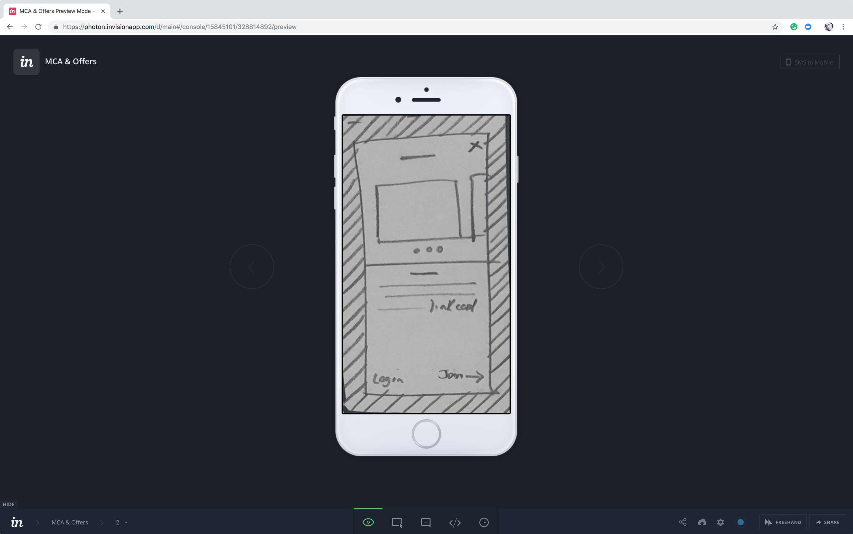
I'll use Figma, now the industry standard and allows you to swap out the wireframes for high fidelity mocks indicative of the real product which team members or clients can comment on. The below image shows a still of paper prototype I created for Walgreens Boots Alliance to unpick a knotty onboarding process which included signing up, logging in, continuing as a guest user and variations of those with and without a loyalty card.
What is UCD (User Centred Design)?
Context of use would be: (1) Identify - who the primary users of the product are, why they will use the product, what their requirements are and under what environment they will use it; (2) Specify Requirements - once the context is specified, it is the time to identify the granular requirements of the product. This is an important process which can further facilitate the designers to create storyboards, and set important goals to make the product successful; (3) Create Design Solutions and Development - based on product goals and requirements, start an iterative process of product design and development; (4) Evaluate Product - usability testing to get users' feedback of the product. Product evaluation is a crucial step in product development which gives critical feedback of the product...so, a fancy new name for the design process then.
Do you use a Mac or PC?
Both.
How do you know when a project is 'done'?
A software product is 'done' when there are no more bugs to fix, all requirements have been implemented correctly and there are no more improvements to make (which is never), however, there is such thing as 'good enough'.
Someone on the team has a strong opinion about how a certain feature should be, but you disagree. How do you approach the situation?
Provide evidence to back up my claims including test results and data that already exists, to keep decision-making objective. Always put your personal interests last, and remain open to being proven wrong. Try and identify what you feel to be true, and hope to be true, and put it to once side. This allows you to discover the right direction.
Have you ever customised a charting library?
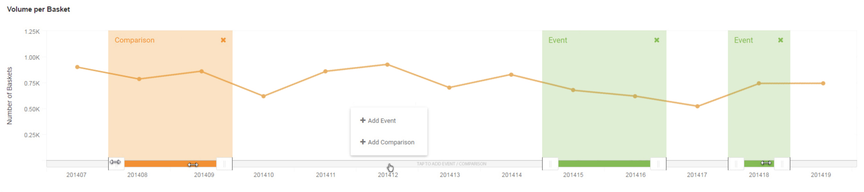
At SymphonyAI, I created many bespoke big data components using Highcharts, one which analysts liked was the in-chart time select slider which allowed them to select an 'event' and 'comparison' from within the chart. Prior to this, users needed to go to a menu or filters panel located elsewhere on the page. With the new design, they can see the piece of data they want to select and can select it directly from the chart. Before I created this, it was fiddly and time consuming for analysts to make these selections to complete a task.
Any difficult stakeholders?
At SymphonyAI, one of the product owners (I was working with 7 different teams, 7 different product owners at the company) wanted to use a wizard built by developers in India instead of using the forms we had created in Richmond. To resolve this I created a prototype of the forms we had designed and explained in an email to both teams why our forms were more efficient by walking them through the use cases, including those they hadn’t considered in their solution. This simple comparison was an easy and immediate way to share the value of the best design with the wider teams but at the same time was the best way to get the product owner on side by offering some objectivity. My aim is to arrive at the best solution so am constantly looking for scrutiny - for people to disprove the claims I can make about a product. That’s what I believe makes me reliable from a business POV.
How do you convince your team to follow your directions?
I always try to remain objective, and where possible I will provide evidence or a reason why a decision has been made. I am always open to new information and suggestions from anyone and like to be challenged. Because of this, I think the teams I work with usually trust me to lead the product on successfully.
How do you evaluate an app without using any tools?
I'd first evaluate how big the problem is that the app solves, then I'd look at how well the app solves that problem, how unique the solution is and to what degree the team has executed the application. For example, you could have an app that solves a really big problem that been executed poorly, or you could have an app that has been executed perfectly and seems to be highly desirable but it doesn't solve any problems at all. If the app is solving a genuine problem and has been properly executed then the next step would be to ask myself if this is an app I, or someone else, would recommend to others. There are more granular ways to approach this type of question but at a high level, these are the three most important factors. Beyond those, I'd carry our a heuristic evaluation audit.
Do you sketch?
Yes - it's fast and it's cheap. I sketch while I am explaining things to people, while in meetings, on calls and while I am working. I sketch and add photos of those sketches to Jira/TFS/Teamwork or similar which really helps developers understand the requirement. Of course, I'll sketch the application out in full before creating a high fidelity or SCSS/HTML version. And on the odd occasion, I still sketch cars.
What metrics would you use for measuring fun and satisfaction?
Users generally prefer products that are fast and easy to use but satisfaction isn't 100% correlated with objective usability metrics. These metrics would include satisfaction, perceived ease of use, net-promoter score (willingness of customers to recommend a company's products) all collectable via a survey.
What’s the difference between a persona and a market segment?
An organisation needs to get its segmentation right before building personas around them. Personas are a single fictional character within a segment, the segment is the group the persona fits within.
What are the weaknesses of personas and how do you overcome those weaknesses?
Personas are a useful tool to visualise the target audience, and they are very helpful in creating user stories during the design phases of your product. They remain fictional however and are not reality. One of their great weaknesses is for people involved in the design process to take them too literally. To prevent this it is useful to keep them as abstract as possible, just like a wireframe should be an abstract (absent of design language) and not a finished product. Another disadvantage is that they can sometimes stand in the way of thinking about how you would use a product yourself - they can actually prevent empathy. When you fail to identify with your audience, chances are you think up rules of behaviour which you normally would not want to be the subject of yourself.
What are the most valuable contributions you make in a product team?
Experience with physical products has given me an opportunity to learn the importance of trying to get it right the first time. Because of this, I have chosen to focus on three main areas within product teams: (1) the design process, through to execution; (2) front end development; (3) CRO. These are the main contributions I make working in a product team.
If you had two products and had to ask one question of users to determine which they preferred more, what would you ask?
Which one would you pay for to use every day, and why?
How do you handle it when people are sceptical of carrying out research?
I push the 'risk' button and highlight how even just a simple usability test would help to mitigate the costly irreversible risk of getting it wrong. I've communicated usability issues to the rest of the team before and received push back from the product owners, decision-makers in senior management positions, and even from engineers. Their rationale is that 'other big companies already use [enter feature here] and since it’s good enough for them then it must be good enough for us'. We could go straight to market with the risk of upsetting some users, and as a result, lose customers and get bad reviews. Or we could quickly test with little cost to the business what we have to find out at the beginning where we are going wrong to mitigate the costly irreversible risky assumption that other companies have done everything correctly. Highlight the risk of losing customers, which would make product owners look bad but in the end, always let them retain the decision-making right. I don't threaten to block the release and acknowledged their right to go straight to market without usability testing. That’s just a small example. Ultimately, design research, and design more broadly speaking as a discipline, is risk management. The truth is, you don't need designers, unless you want to stay ahead of the competition, avoid costly mistakes, navigate ethical decisions, achieve your goals fully, and optimise effectively.
Do you work in Agile teams?
Yes, most software teams are Agile these days and most teams I've worked with have been Agile at some stage or if they are not they are mostly aware they should be.
How do you integrate the design process into an Agile team?
I’ve spent much time talking about this with Agile coaches over the years, and it’s a question I always get asked because businesses always have conflicts here. The good news is the design process and Agile methodology can easily coexist. Teams can carry out a single phase of the design process within each sprint, for example, you could carry out a reasonable discovery phase in two weeks which could be sprint zero or sprint 1. The pain points I’ve heard about Agile coaches vs product designers are mostly around what their definitions of an MVP are. Agile defines the MVP is an ‘experiment’ that the whole team should be prepared to completely redo if the MVP is unsuccessful. Product designers would also use this definition. So everyone is agreed this far. The issues begin with the quality and process of how the team arrives at the MVP - the risk with pure Agile teams is they can often base the MVP on an assumption to get “something out there, anything out there” and let the market tell us everything we need to know to inform the final product. Whereas the product designers (in an almost complete opposite way) would insist there is at least some kind of discovery phase, hypothesis and validation to arrive at that MVP to get the team a few steps closer to the final successful product first. Another difference is that the product designer would insist the MVP is executed perfectly. Often unhelpfully dismissed as 'cosmetic', the reason product designers would insist on executing MVPs perfectly is to prevent skewed results and loss us trust with the customers before we've even really begun. This can be measured as low engagement, low conversions with nearly zero WOM/Net Promoter Score where even users themselves would not return which all put the business at an immediate disadvantage. As a product designer, I always recommend teams I work in that are not Agile, become Agile. The above example is just the biggest risk when working in an Agile team - your product can end up being based on assumptions. Of course, the risk with giving the initial authority to the product designer is you'd need to have a lot of confidence with the product design lead because if the product designers lack experience, the team can end up in an equality problematic position.
How would user stories be designed in the Agile teams you've worked in?
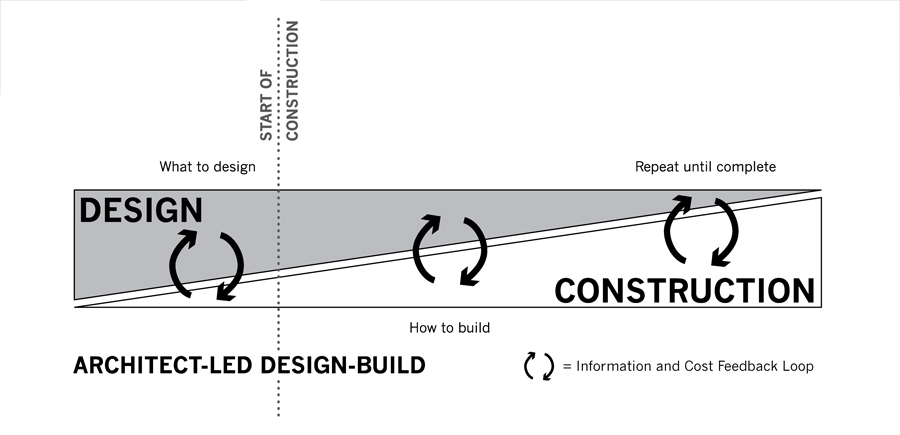
The two most popular ways teams work are: (1) UX work only happens during the sprint in a very ad-hoc, collaborative way, which is cheaper but riskier long-term, and/or; (2) a small tight-knit dev team with a product designer works ahead a few sprints to properly inform the main sprint team, allowing them to build faster and more accurately. This second method closely follows methodology architects have used in the construction industry for over four millennia called ALDB (Architect-Lead Design-Build). Like Agile, this process is about collaboration and constant iteration which also allows the designers to fully exercise the design process, eliminating the pain points with method 1. If companies don't have the resources for two teams then my time will be split between method 1 and method 2. Larger organisations can split up teams in three ways, the main team would be working on current work (like method 1), while a smaller team works on the tricker most important work the bigger team needs to get right (like method 2), this team would probably work in a more lean way. Then a third much smaller team will work on the future product and vision for the next 5 years and beyond, sometimes called, or similar to, an 'innovation lab'.
Have you delivered a project to meet a particularly tight deadline?
I once designed and built an app with a small team I managed in 10 days. At SymphonyAI we needed to create a web app that used real data, the data was ready as an analyst and myself had already created an Excel product that used the data we needed. We had 10 working days to turn that Excel product into a desktop web app that could also be demoed on an iPhone and iPad to a big retailer. We completed the work on the tenth day and I was responsible for running the team which consisted of the analyst, one back end dev, one front end dev and an external consultant.
How do you make products easy to use?
Good UX is about predictability i.e. if a user takes X action do they know that Y is going to happen? You need to ensure that the design patterns and user journeys are extensible and appear the same on different devices and viewport sizes. Always try and only build what you need, Leonardo Di Vinci said: "a poet knows when he has reached true perfection, not when there is nothing left to add, but when there is nothing left to take away".
Which were your favourite A/B Tests?
I spent a few years working in CRO where I carried out A/B testing daily (using Google Analytics because it was free) to create more profitable sales and landing pages. For example, one of those tests took only 5 days to complete but increased annual revenue by over 13%.
How would you describe your role in under 10 words?
To efficiently discover, resolve, execute and validate novel ideas.
View work chevron_rightcopyright © Richard Heale