menu
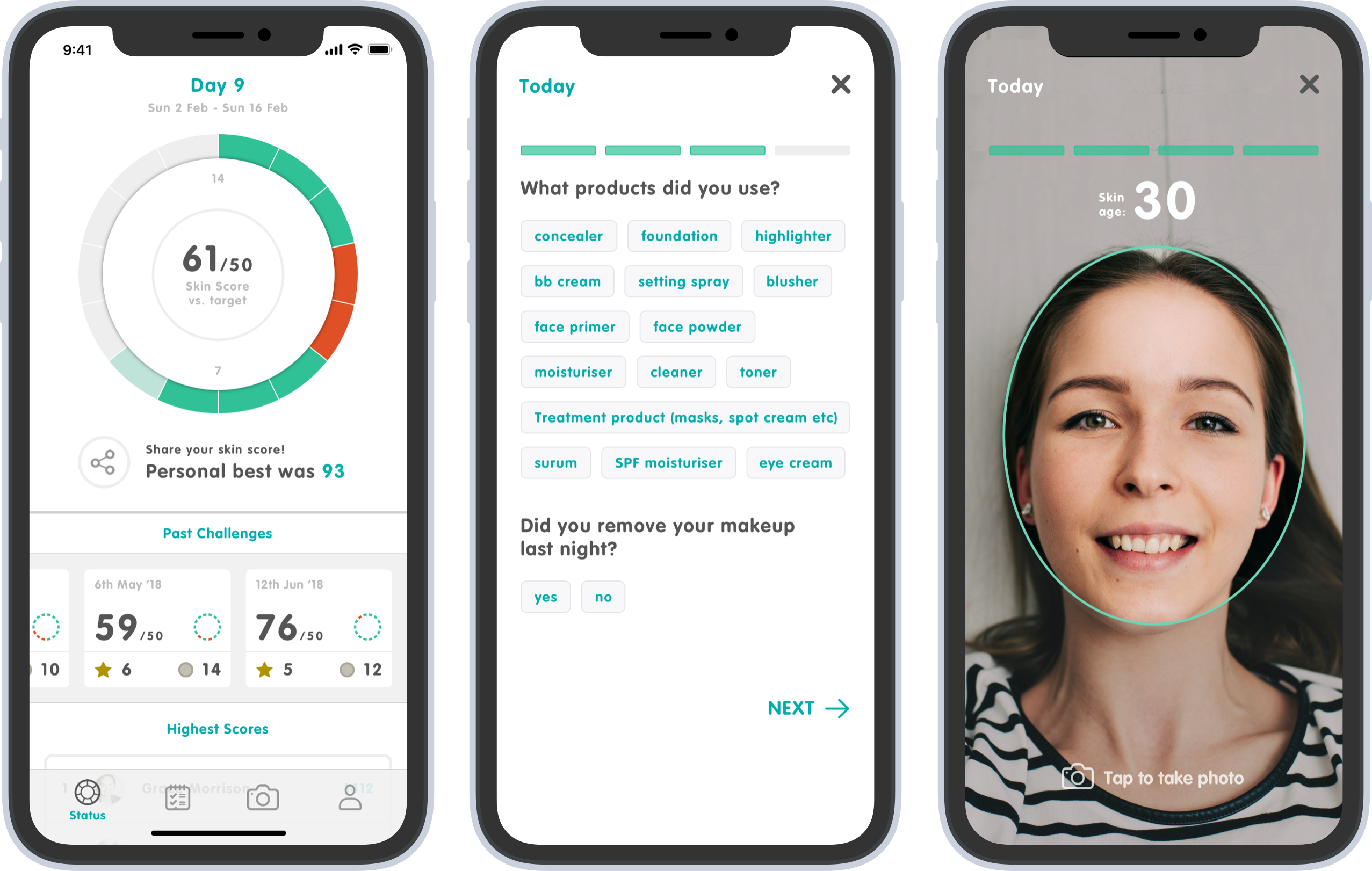

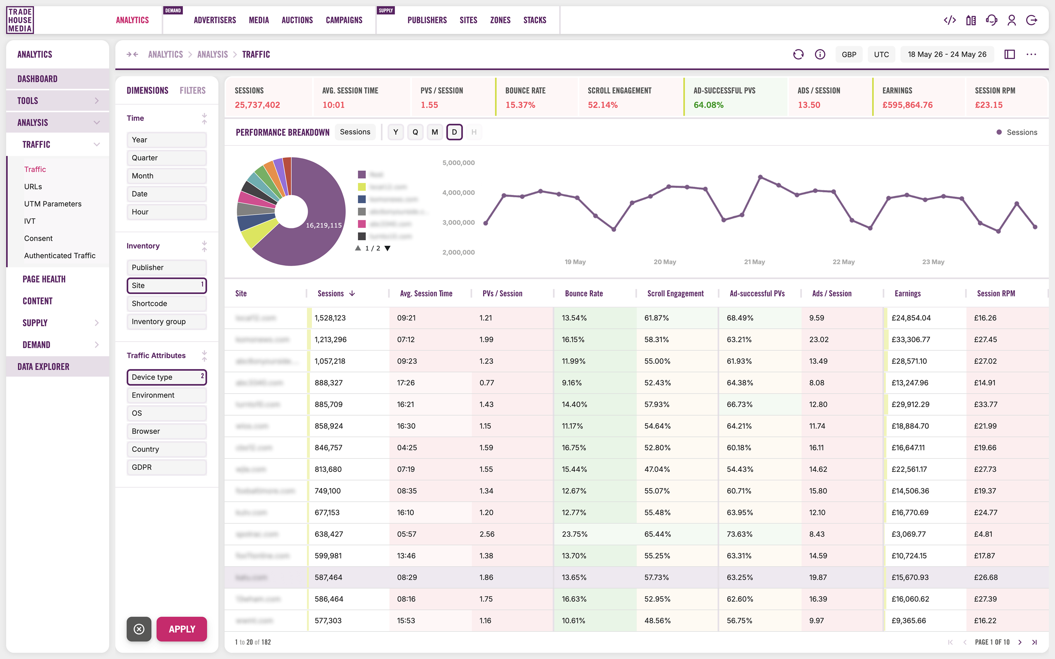
Problem:
Publishers managing programmatic advertising across web, mobile web, in-app and CTV relied on fragmented tooling, separate systems for header bidding, ad serving, analytics, identity and inventory. Configuration changes required engineering involvement, creating bottlenecks that slowed yield decisions. Ad ops teams spent time reconciling data across platforms rather than acting on it, and the technical complexity of ad-tech kept the people responsible for revenue performance at arm's length from the controls they needed.
Solution:
A unified ad management platform that consolidates inventory management, auction management, business intelligence and AI-driven automation into a single interface. Including product architecture, user journey and workflows refinement across all four pillars. The core design challenge was translating deeply technical ad-tech functionality, for example, prebid configuration, floor pricing, bidder orchestration, real-time analytics, into operational tools that ad ops teams could use without engineering support, across web, in-app and CTV environments.
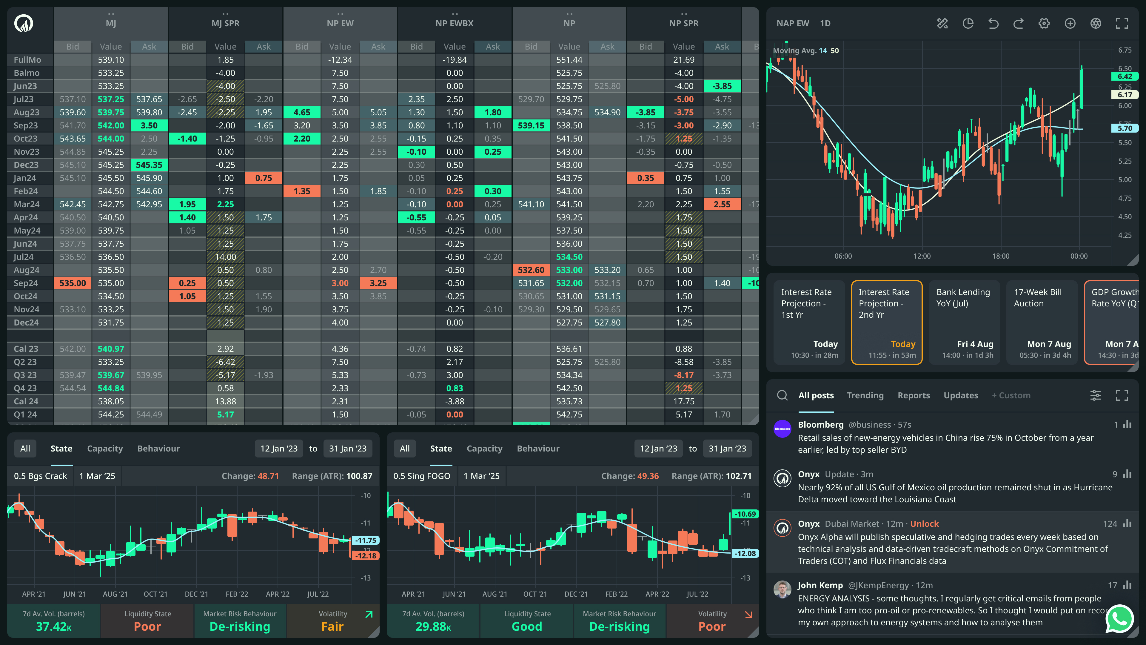
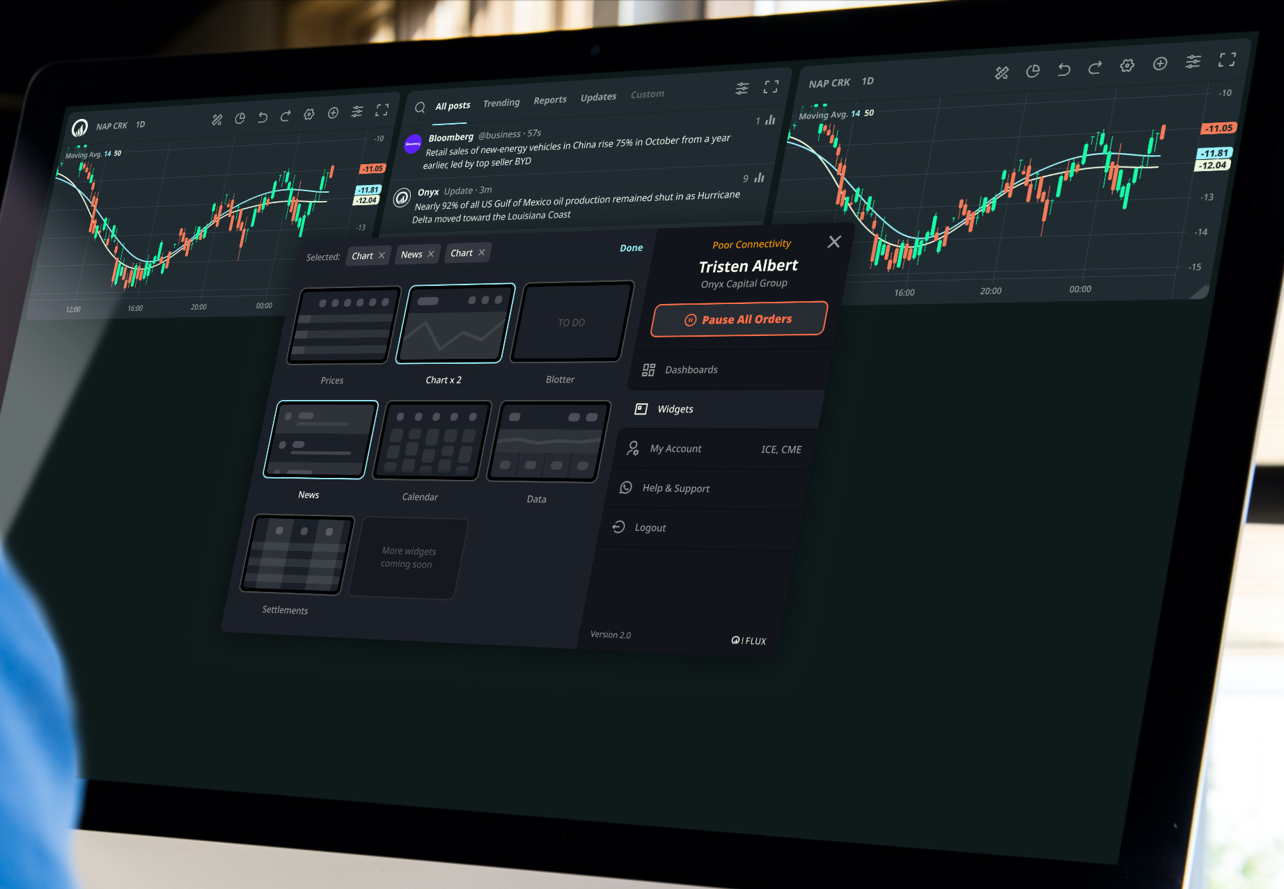
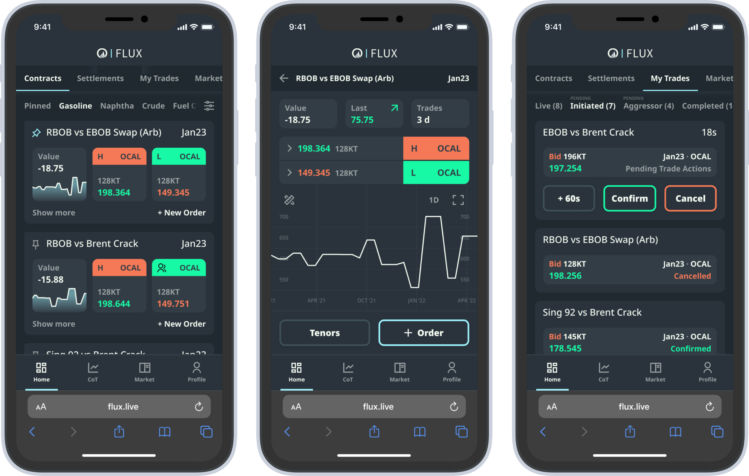
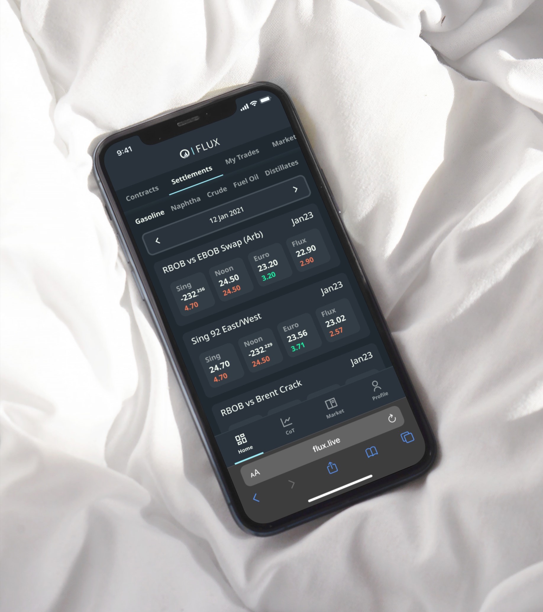
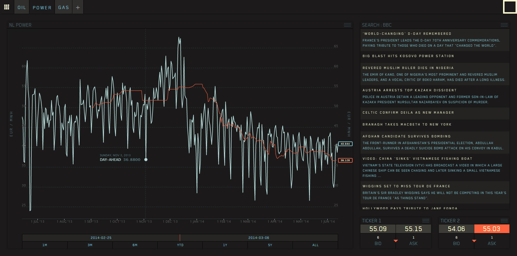
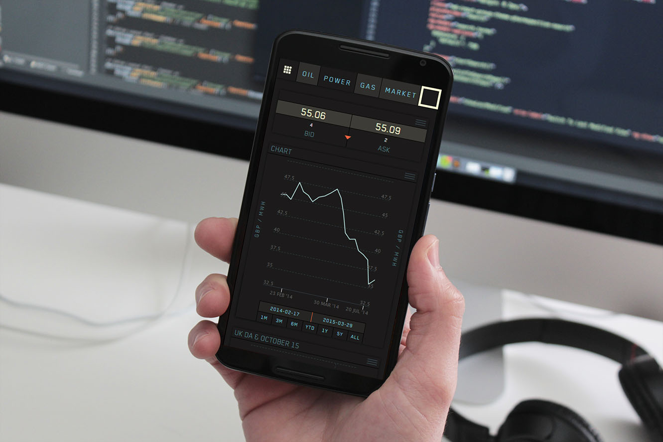
Problem:
After Onyx acquired a new CTO, we were ready for phase-2 - the redesign of Flux. Onyx are the number-1 liquidity provider for oil derivatives anywhere in the world. So we needed a platform to reflect this. We identified core KPIs and realised we needed to start from scratch. The data Onyx has is unique, they are market makers but do not have a platform that incentivises traders enough to use as part of their workflow, which is essential if we are to achieve the main objective of increasing liquidity.
Solution:
Working with various traders and industry experts, we simplified the application by allowing traders to build their own dashboards via a widget system. We slightly reconfigured how the data is presented to match that of some popular competitors and simplified the mobile experience to only show prices, which is all that traders would need access to hen they are not sat at their desks. Feedback sessions were successful as the app is not only more desirable, it is also now a platform on which Onyx can build as they grow and change direction, instead of having to change the platform as they build out new features - a new feature or module can simply now become a new widget traders can add themselves, where they want, and how they want.
Feedback by Steve Rose, Senior Product Owner:
"...I worked with Rich while at Onyx and he's been a key member of the team, being responsible for a much needed product overhaul of our Flux platform. Having worked with trading tech teams before, I've been really impressed by his knowledge and passion as well as his ability to think outside his specialism, factoring in CRO to his work and helping to craft the strategy for the next iteration of our platform to make Flux the best trading platform in the world, and without Rich that goal is not possible."
Problem:
As a phase-1 of a redesign of the Onyx oil swaps trading platform, Flux, we analysed the core customer journey to identify as many issues as we could. We had an existing backlog of issues to resolve while also carryout out customer journey map sessions with traders, brokers and researchers to define and prioritise the issues, ordered by the likelihood that the solution would increase liquidity.
Solution:
For phase-1, while we carried out the reskin, we resolved many front end issues, by removing all pain points taking the opportunity to start creating a completely new design system and set of front end components in React ready for phase-2, so little of the effort would be ‘throw-away’. New features for phase-1 included an internal admin dashboard, customer management, user profile areas, and data dashboards developed by the data science team.
Feedback by Bruno Chaina, Tech Lead:
"...I have had the pleasure of working with Richard for the past year as a Tech Lead for Flux, a data visualization and trading platform. He is an exceptional product designer who always delivers high-quality work in a timely manner. Richard has vast experience, he is creative and collaborative and has contributed significantly to the success of our releases. One of his most impressive achievements was increasing the conversion rate of our user sign-ups through his innovative onboarding solution. He also helped developers with HTML and CSS implementations. He even helped with SendGrid, configuring many templates. He acted as a PO/BA by setting up meetings with other departments to fully understand what needs to be resolved with our software. He has a keen eye for detail and always wants to be busy; he displays proactivity by starting to work on things even before we create tickets and assign them to him. Sometimes I thought his estimates were too optimistic, he said things like 'I can do it in 30 minutes' and he always proved me wrong, as he delivered the update in that timeframe. I cannot ask more from a product designer than what Richard has offered to our team."
Problem:
Our political system is failing. Trust in mainstream media, politicians, election results, and even social media is at an all-time low. Big Tech platforms are increasingly viewed as biased gatekeepers, enforcing ideologically driven censorship instead of fostering open discourse. At the same time, political engagement is higher than ever, but it often lacks a constructive outlet that benefits society. Constituents feel disempowered, stuck choosing between two personalities or party manifestos that only partially reflect their values. Combined with low voter turnout and persistent barriers to participation, the result is a system that alienates more than it empowers.
Traditional voting systems reduce politics to a binary choice between two broad packages, each filled with policies voters may oppose, simply bundled with the few they support. Parties focus more on retaining power than collaborating on solutions. Meanwhile, citizens pour time into debates on social media, podcasts, and threads that rarely translate into meaningful influence. Though much of our democratic structure still functions, the cracks are growing. To preserve what works, we must confront what doesn’t, rethinking how everyday people engage with and shape the policies that govern their lives.
Solution:
PolicyVoter is the first UK blockchain company to collect a vote for the UK government. It reimagines democracy by shifting the focus from personalities to policies. Instead of choosing between two broad manifestos, users vote directly on individual issues they care about in either their constituency or country. Politically neutral and open to everyone with internet access who are eligible to vote, it removes barriers like paperwork, travel, or even party affiliation. Policies appear in random order to eliminate algorithm (or editorial) bias, giving every idea a fair chance based on its merit.
Built on a decentralised, blockchain-based platform, PolicyVoter ensures complete transparency and security. Votes and policy submissions are tamper-proof, with quarterly audits by independent reviewers to keep the system trustworthy and up to date. The platform will be eventually fully open-source, with no hidden algorithms, no ads, and no data exploitation, everyone sees the same public information, creating a fair and ethical experience for all users.
More than a voting tool, PolicyVoter channels political energy into action. It turns online debates into structured, vote-ready proposals and invites communities to co-design policy ideas without ideological interference. By connecting digital participation to real-world outcomes, it fills the gap in today’s democracy, restoring trust, clarity, and fairness, one policy at a time.
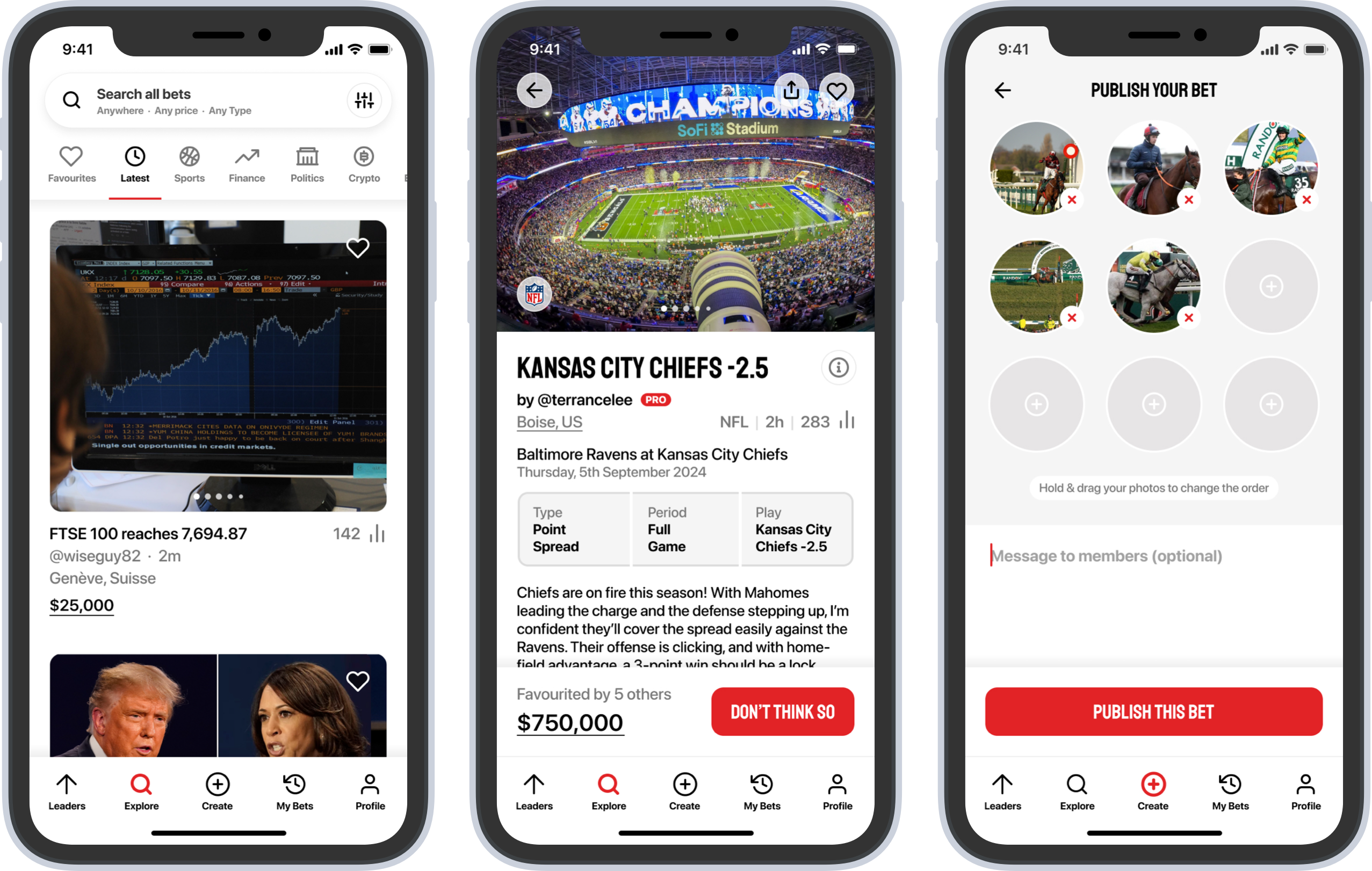
Problem:
One problem HNWI bettors have is the lack of availble options to place high-stakes bets. We have solved this problem by designing a plaform solely for this purpose. Members can place $25k bets (or match them), while PRO members can enjoy stakes up to $1M, reduced commission from 5% down to 2%, and see bets offered an hour before anyone else.
HNWIs need reassurance that their personal identity and financial data is secure, and concerns about trust can arise from a lack of transparency in odds, fees, or transaction handling. That’s why our service operates on the blockchain, ensuring full transparency along with robust security and data anonymisation for both members and their data.
Standard betting platforms can be overly complex and unintuitive, especially for time-constrained HNWIs who may lack tech expertise or betting experience. We’ve streamlined our user journey through extensive usability test sessions to ensure that even those unfamiliar with betting or technology can easily place a bet or learn about betting in familiar markets.
HNWIs often require rapid and efficient transactions, both for depositing and withdrawing funds. This is why we also leverage the use of USDT (stablecoin) for betting. With this, depositing and releasing will be automatically handled by the smart contract which allows members to enjoy real-time withdrawals straight to their digital wallet address.
Solution:
ibetu is the world’s first peer-to-peer betting service designed for High-Net-Worth Individuals (HNWI). Our app allows members to effortlessly create bets and accept others' bets with just one tap. Members can challenge bets created by others or create their own bets for fellow members to take on—no odds required. With a minimum bet of $25,000 across all popular betting markets, including sports, finance, politics, entertainment, niche, and many more. Tailored for those who seek a premium betting environment, allowing members to connect with peers who share a passion for high-stakes betting. We will also be offering a PRO account subscription to first 100 members, perks include: even higher-stakes maximum bets enabled ($1M stake up from $25k); Reduced commission (2% down from 5%); See bets an hour before anyone else.
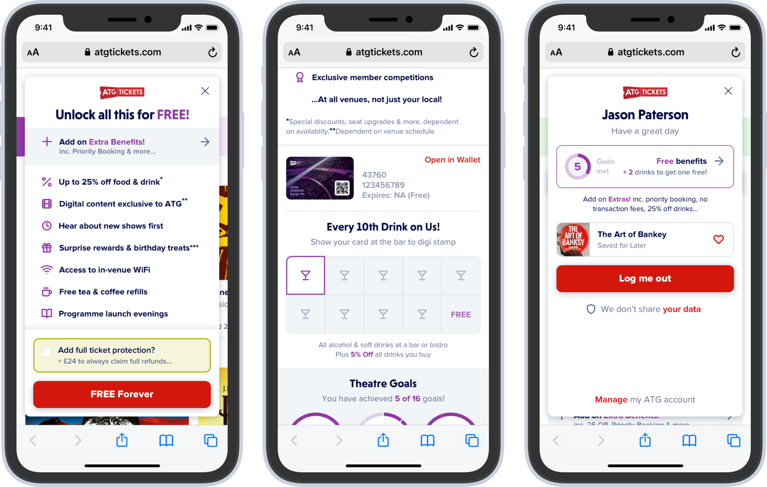
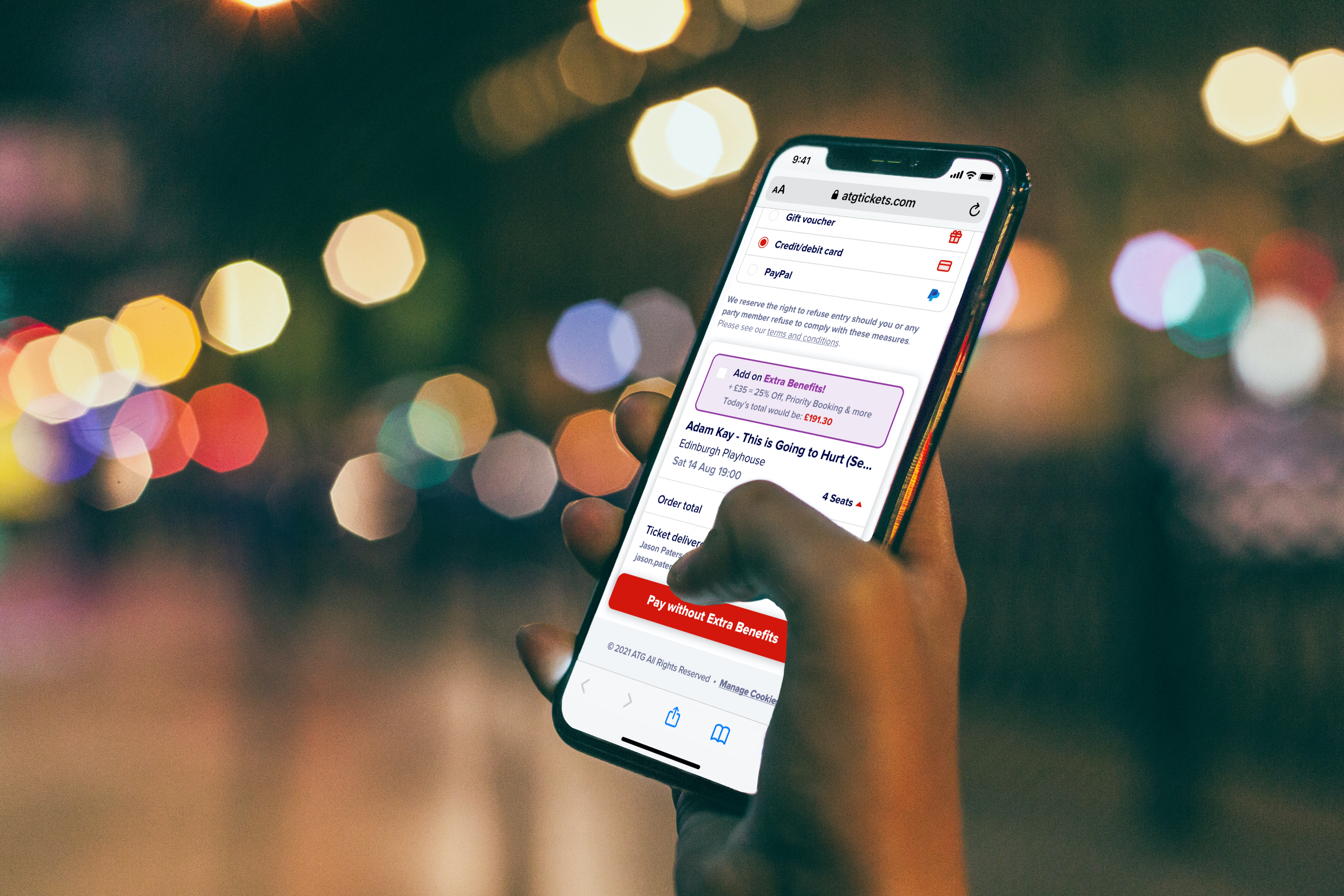
Problem:
ATG are the largest theatre company in the world and wanted to discover how theatre could respond to the pandemic, possibly with a loyalty program with an aim to use data to drive future business decision-making. Without getting left behind, ATG wanted to be able to build an ecosystem with targeted partnerships in and out of the industry to support bringing people back to the theatre.
Solution:
Carried out full discovery as part of a cross-functional team of data science, marketing and engineering to understand what a new loyalty proposition could look like to increase frequency and spend in the new post-pandemic world with a deadline 6 months away. The end result was a highly optimised version of ATG’s existing program to improve the experience for existing members, facilitate the onboarding of new ones, while also paving the way for a much larger program in the future.
Feedback by Marc Roberts, Head of Engineering:
"...Rich has been an amazing addition to the team whilst he's been with ATG. His critical thinking really helped untangle some very complex parts of our platform, and he championed the customer the whole way, whilst being very pragmatic when dealing with the limitations of the platform and honestly, the available budget. Rich brought in a wealth of domain knowledge from other industries which he was able to selectively apply where appropriate, and his understanding of our domain grew every day, which I very much appreciated. Rich is also a boon to engineers - he understands the needs around tooling, how designs should be communicated with engineers, and worked diligently to understand the platform's technical requirements. Rich also undertook more theoretical tasks at ATG which I wasn't personally involved with, but I did see the outcome of those studies, both as reports and in the subsequent output, and it was great to see the discipline in its full glory. Our platform will be improved greatly owing to the influence that Rich had on the business."
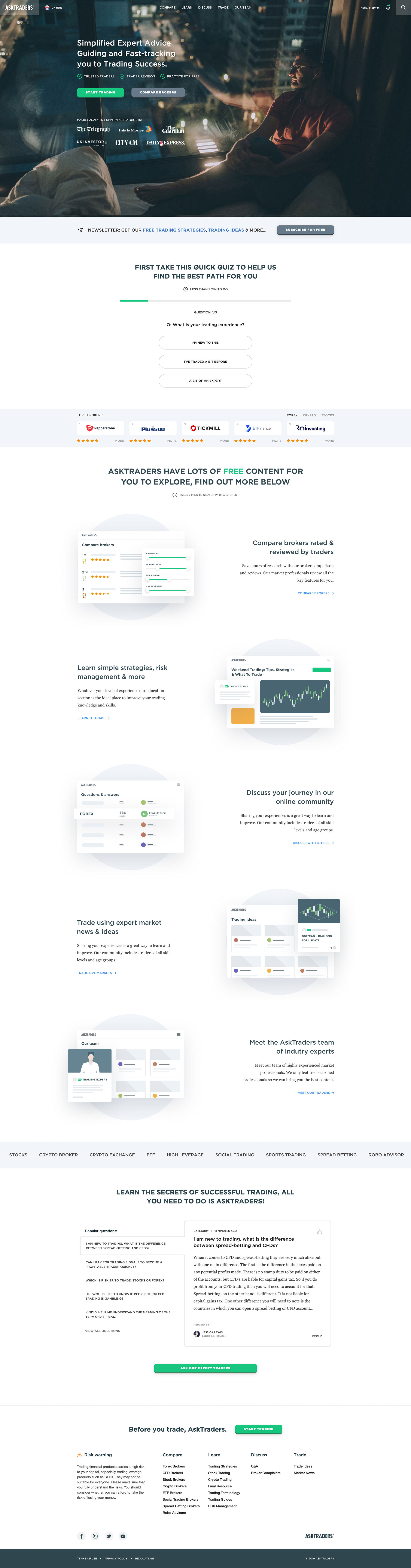
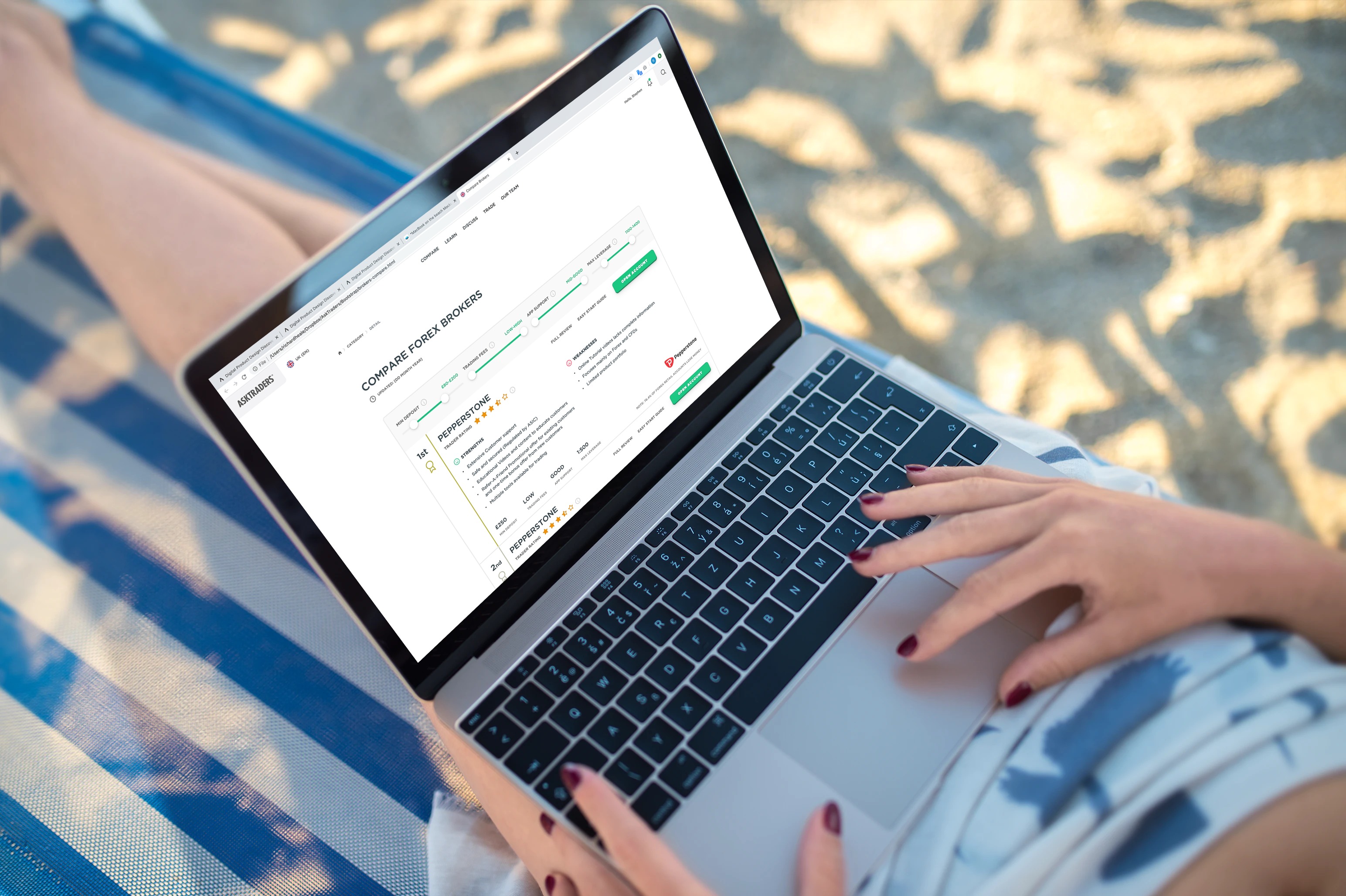
Problem:
The AskTraders’ web app had a very high bounce and low conversion rate. They had been given a big budget by the business to rectify this issue in order for the app to begin generating the revenue target. The only form of monetisation was in the form of inefficient click outs via broker logos which did not convert well into an NDC (New Depositing Customer). The challenge was to optimise the app, making sure SEO were closely involved along the way, in order to not affect Google indexing.
Solution:
My strategy was to come in and begin carrying out research to identify user requirements and knowledge. Once we had some basis on which to form a hypothesis, I put up all the research on the wall and began sketching a viable solution. This was wireframed and presented to the wider team. We decided to quickly build the solution after creating it in Figma using Bootstrap. I built the front end, working with the development team who stitched the new journeys into the live site, releasing incrementally. I then helped the team A/B test the new variants.
Feedback by Miles Burroughs, Product Owner (Trading):
"...what can I say, in the words of Fred Pontin... “Book early!” I’m showing my age, bad commercials references... You need this guy on your team - user research guerrilla/qualitative, prototyping, UI & front end development. He’s been instrumental in delivering a step-change across the domains I look after."
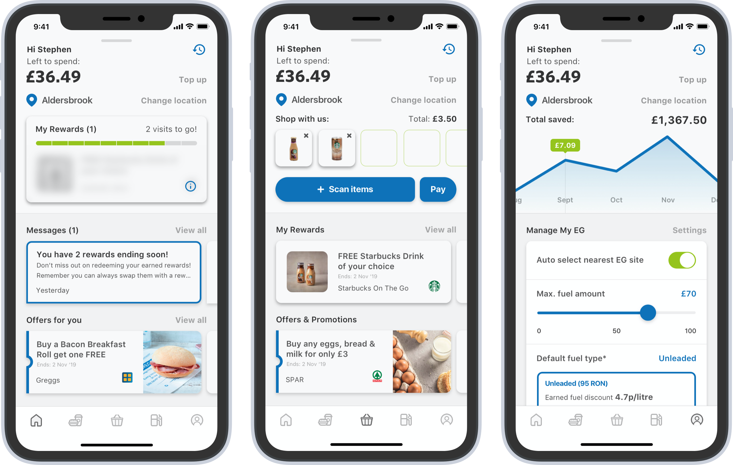
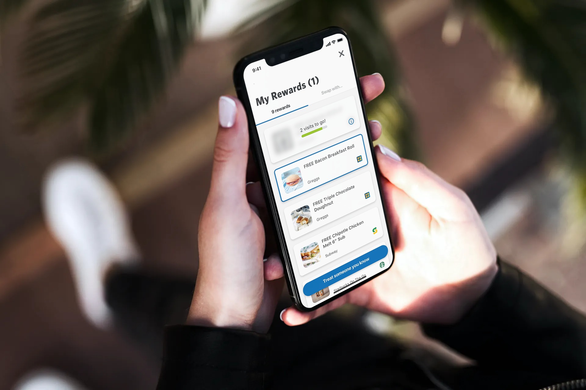
Problem:
EG is a unique family run business who provide service stations, typically within towns and cities, housing many brand partners, for example, Starbucks, KFC, Esso and Shell. The challenge was to create an extension of this on-site experience (where users can pre-order food, scan and enter the shop, or pay for fuel at the pump) in a simple mobile app that provided loyalty across many of these brand partners who already have their own loyalty programs. This has never been done before in any loyalty app.
Solution:
I carried out an intensive six-week discovery program designed by Annah Lansdown at Photon. EG set up meetings with each of the brand partners, initially for the UK, but with global EG teams present, to present the goals and try to identify any problems we might face. At the end of the six weeks, which was extended to eight, we had created a clickable high-fidelity prototype which EG could then take back to the business taking the project to the next stage.
Feedback by Martin Fletcher, Lead Product Designer:
"I worked with Richard as part of the design team on a mobile app discovery project while he was at Photon. Richard was an exceptional design leader and managed key aspects of the design and discovery process for the app. What was clear was not only his design knowledge, but his interpersonal skills when managing multifaceted teams and key stakeholders. The design deliverables created were impressive, and he would compliment any high profile design project. If you have the opportunity to, hire him."
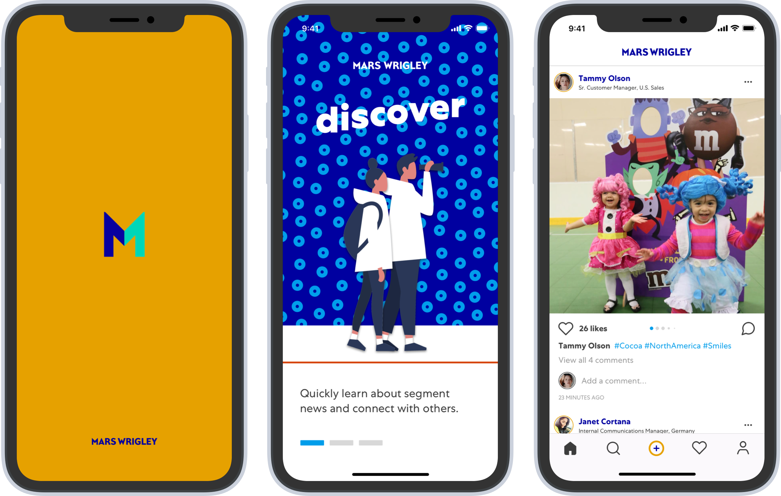
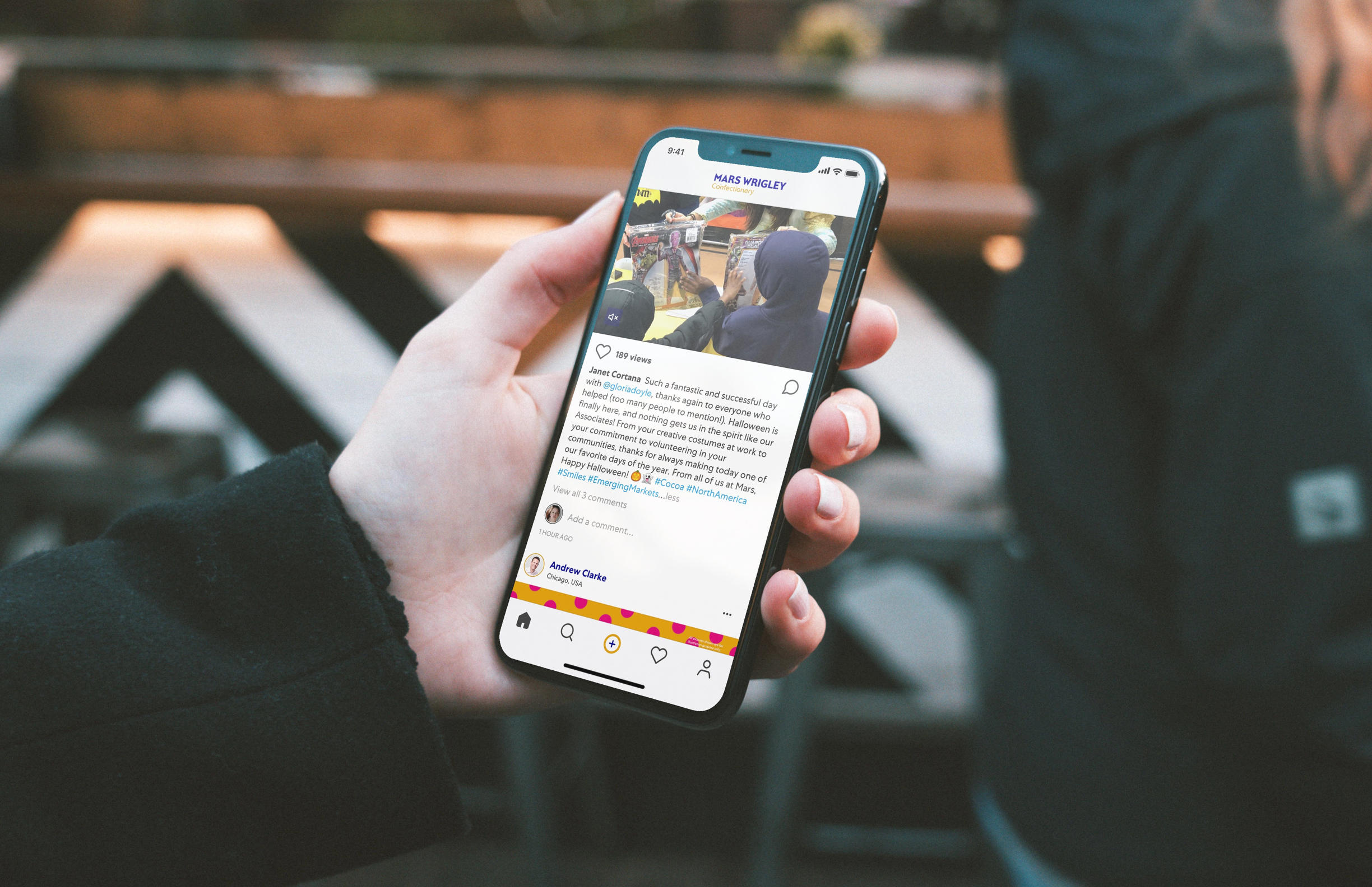
Problem:
Mars needed an internal communication tool to allow associates to talk to one another, giving transparency across the activities of the entire company. This would also provide leadership with a much faster and more engaging alternative than creating and sending an email newsletter.
Solution:
Mars said they "needed Instagram but for internal use only", so that's what we gave them. The challenge was to carry out the legal checks, making sure that copying the same design patterns would be legal. Once checked, we designed and built the first release for Mars to pilot to a select number of users in just a matter of weeks. We carried out A/B tests on the users, along with a quick survey, which allowed us to make some small changes to carry out phase two and release the build to the entire company.
Problem:
Boots Beauty wanted to create a digital skincare product that offered the same value as a physical product they could sell in-store.
Solution:
In a six-week discovery phase, I worked with Boots’ Head of Innovation and the wider skincare team researching the market to discover how we need to place a digital product. The result was an app that used machine learning to guide the user through a two-week challenge with the aim of improving the skin. The app is highly gamified and offers a unique alternative to a very labour-intensive and ineffective skin diary app.
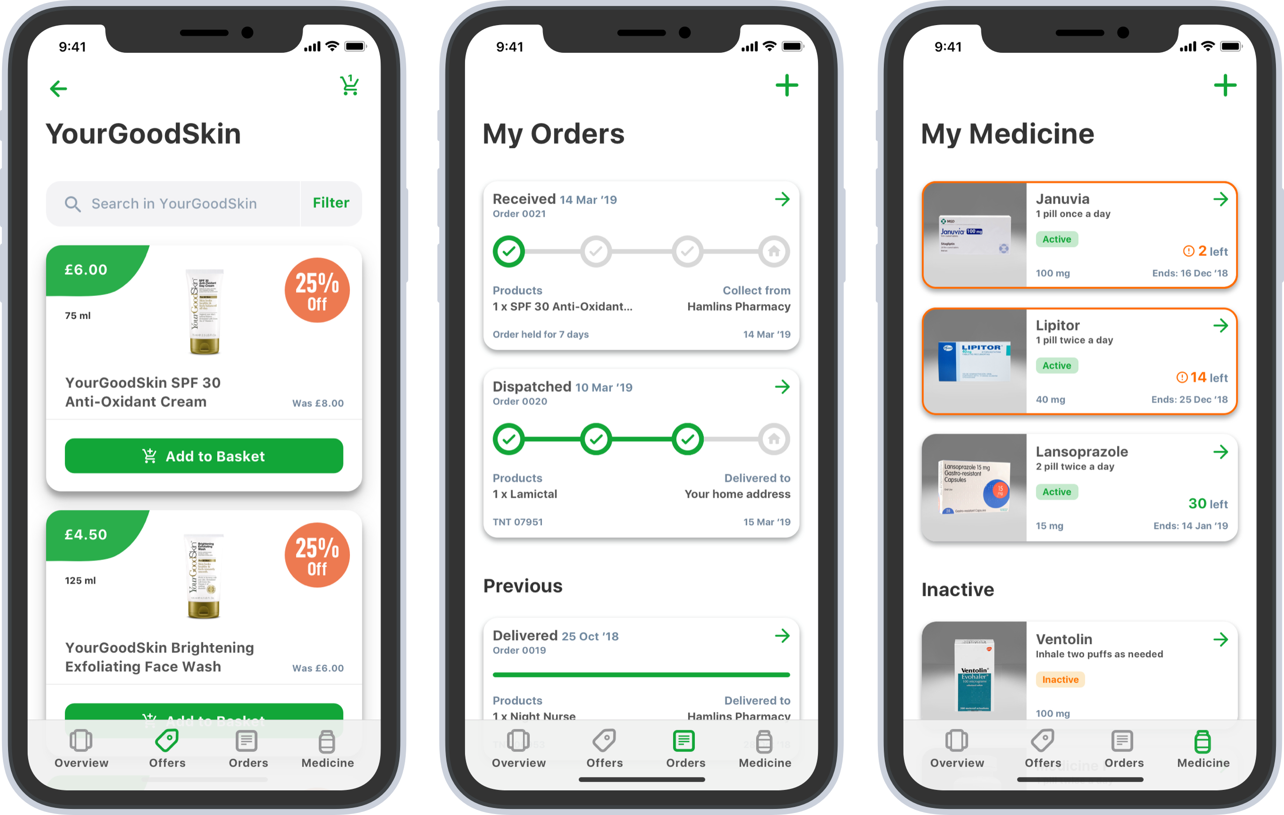
Problem:
Currently, pharmacists are using outdated technology to manage their stores and patients. Working from a desktop computer, they are unable to view important data visually and manage stock easily.
Solution:
We created an app for an iPad Mini enabling pharmacists to be out on the floor dealing with customers while carrying out their work. The pharmacist app visualises the data, has a simple to use planogram and allows them to manage patients’ medication which talks to the consumer-facing mobile app. The app also allows pharmacists to manage ‘click and collect’ products and loyalty schemes.
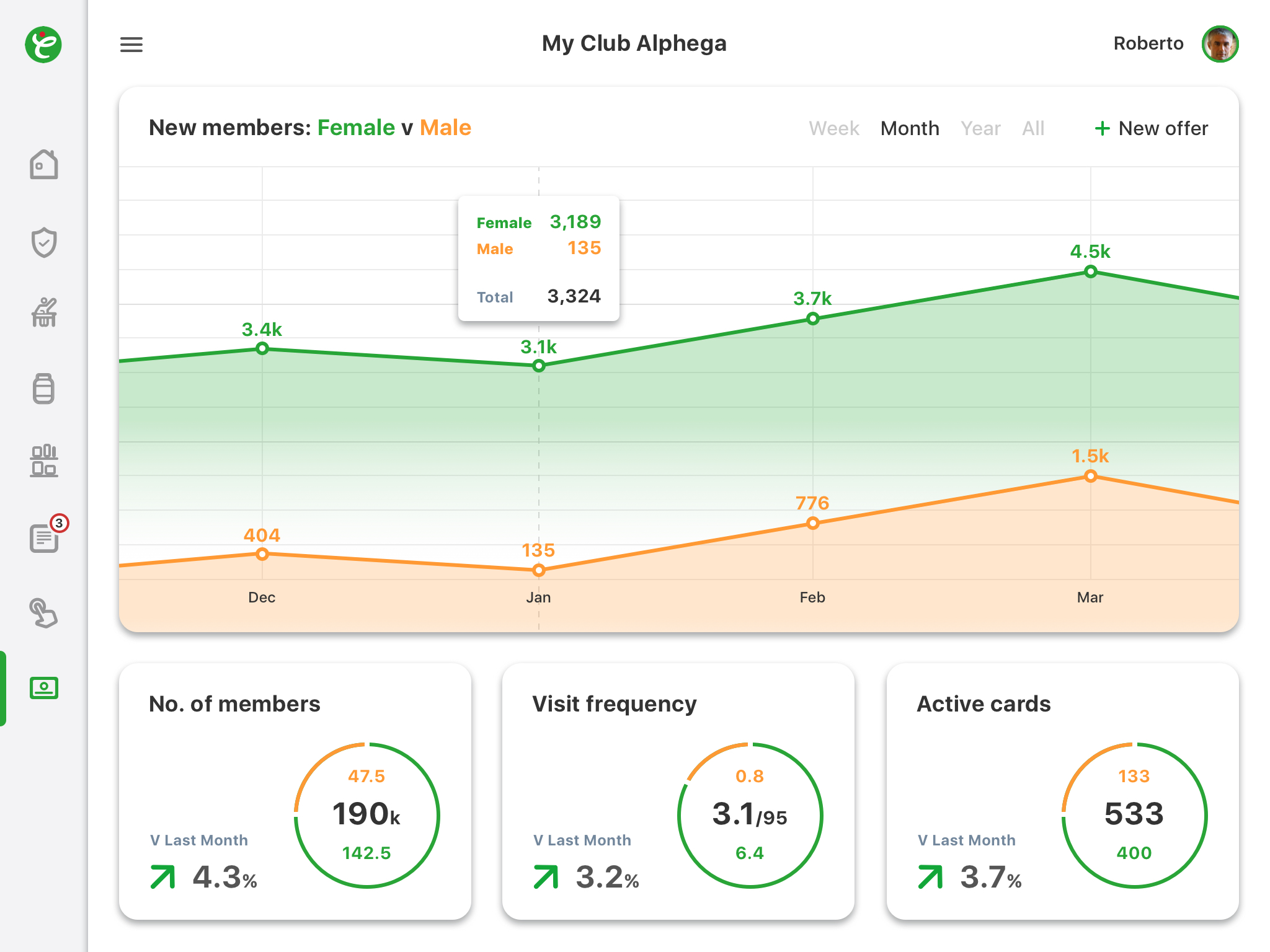
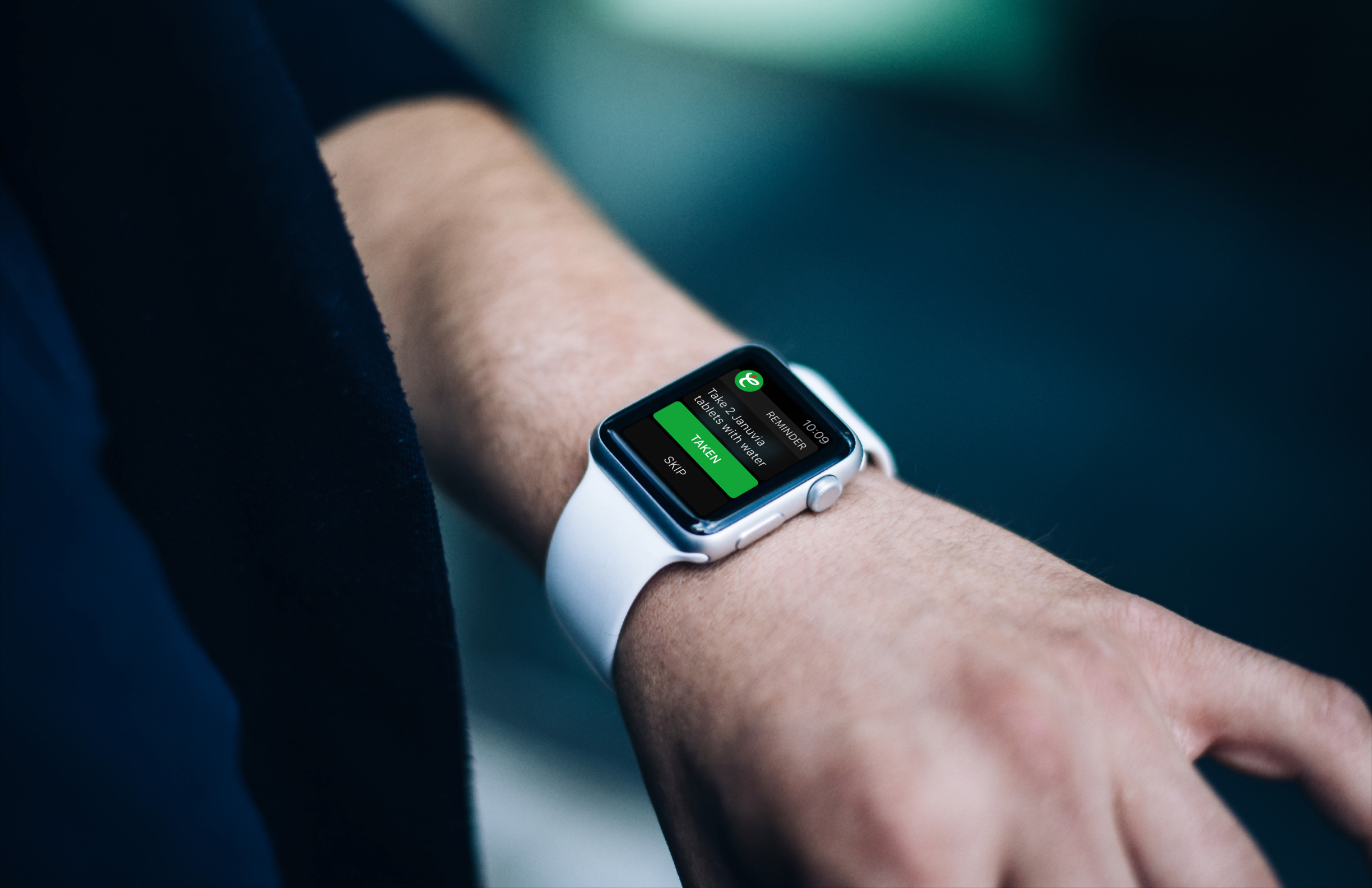
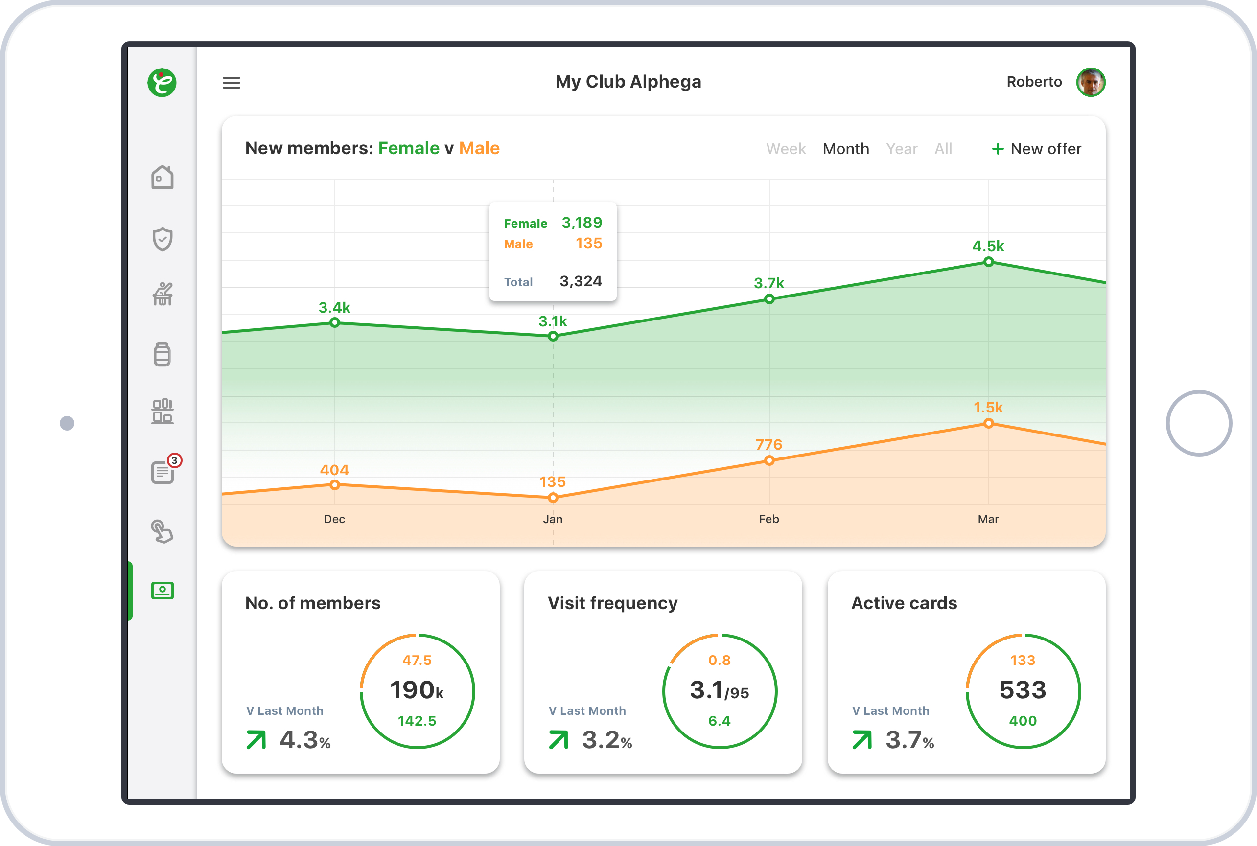
Problem:
Alphega needed a new method to monetise their digital consumer experience while also giving users the ability to manage medication.
Solution:
We created a simple shop experience which allowed various ways for users to order from the pharmacy, including ‘click and collect’ and automated postal orders. Extensive iterations were developed of this product and this is the final version.
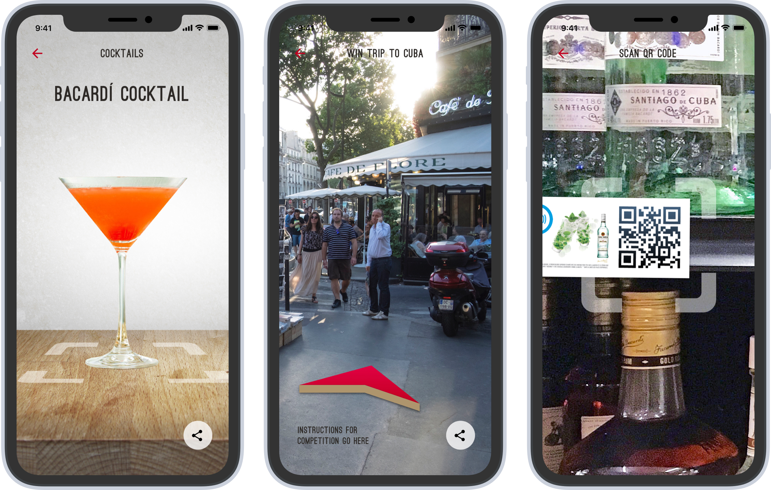
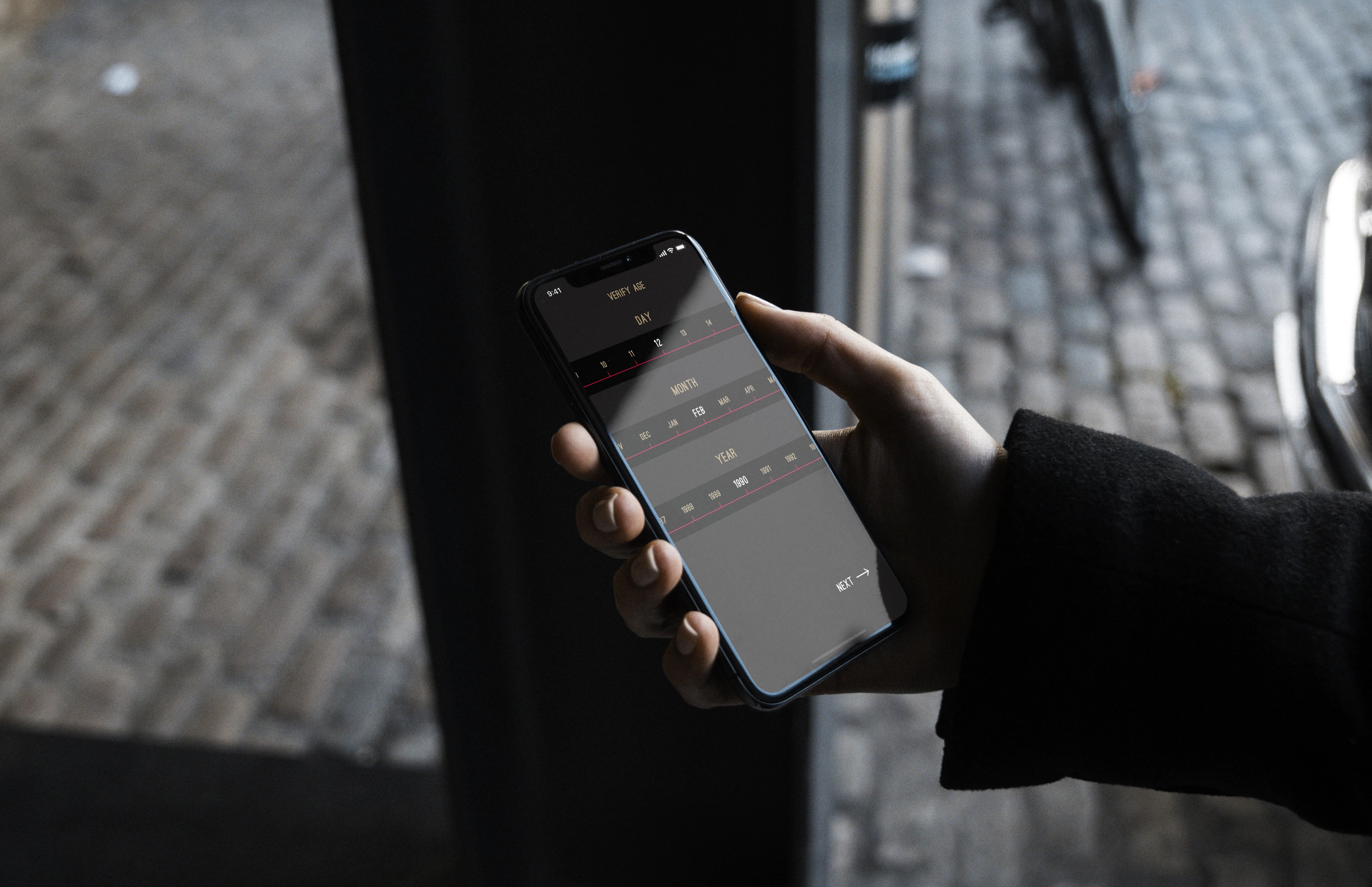
Problem:
Bacardi wanted a new and innovative way for customers to engage with their brand, drinks and marketing teams.
Solution:
We exploited the potential for using augmented reality in an application using select game mechanics driving users to find out where they could buy Bacardi drinks, while also being able to compete against each other presented in a leaderboard to win a trip to Cuba. As an alternative to a standard menu, users could also use augmented reality to place a virtual cocktail on a table in front of them so they could so what popular cocktails that use Bacardi look like.
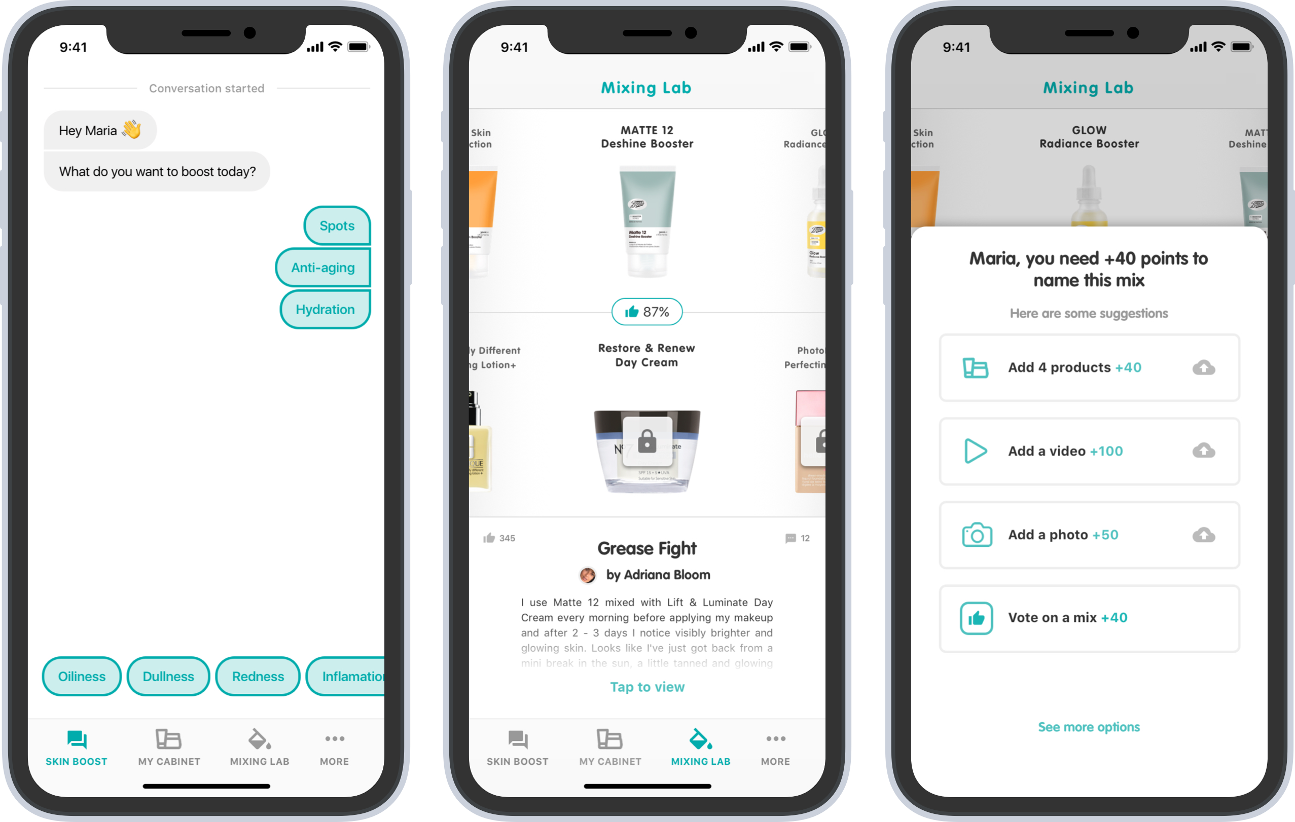
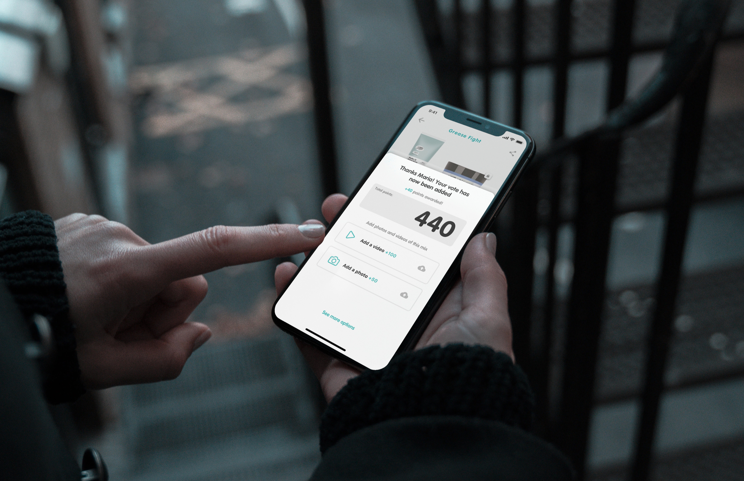
Problem:
To satisfy the needs of the consumer, Boots Beauty had created a new Booster product providing a cheaper way to alter the properties of an existing and potentially expensive product. They wanted an app to help the consumer navigate the Booster community giving them the best possible chance at creating and finding products tailored just for them.
Solution:
We created a diagnostics tool designed to provide the user with the correct Booster for their skin type. A 'cabinet' where users could pair a product they already own with a Booster which provided the opportunity to view other users’ comments and permanently name their own mix if they are the first do so. The final module within the app is one where users can view all the top-rated mixes, search and filter all combinations and if they see a mix they like then they can make in-app purchases via an 'unlock' button.
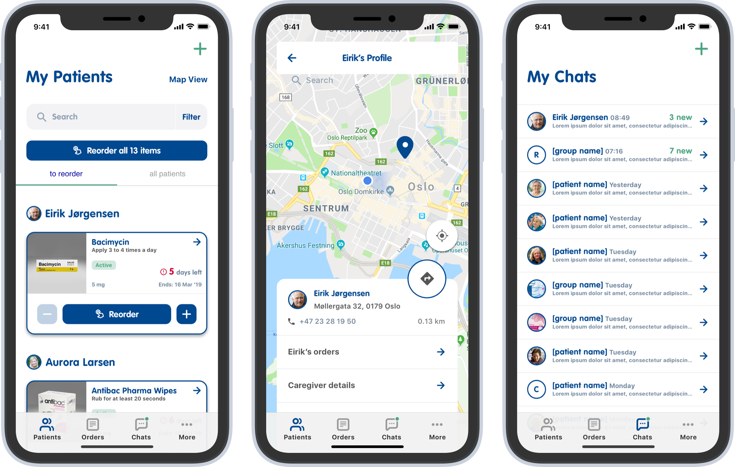
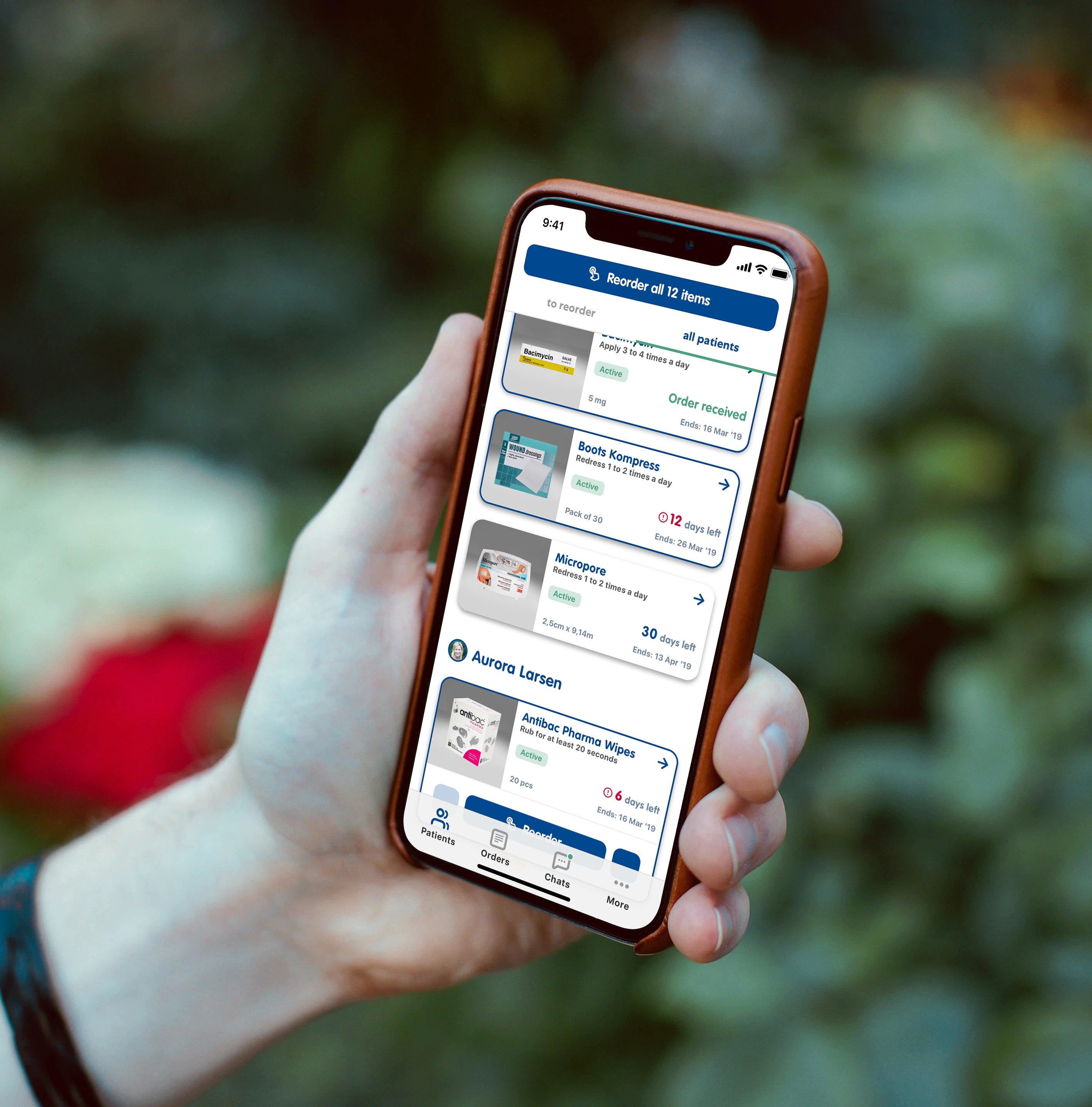
Problem:
Boots Norway needed a product for home carers, who currently have no way to manage the medicines needed for all the patients they care for and have no way to communicate with them. Carers spend a lot of time driving to patient homes and have to carry various bags while entering the property of each patient so they don't get much time to spend on their devices.
Solution:
I worked remotely with the Boots Norway teams and began to wireframe, presenting to them each week on a call. Finally, we came up with a solution which I designed to be used with one hand, allowing carers to carry out main tasks like ordering medication for multiple patients with a big button in the middle of the screen with one tap. Carers can also chat with the patients or the caregiver via a WhatsApp like interface within the app.
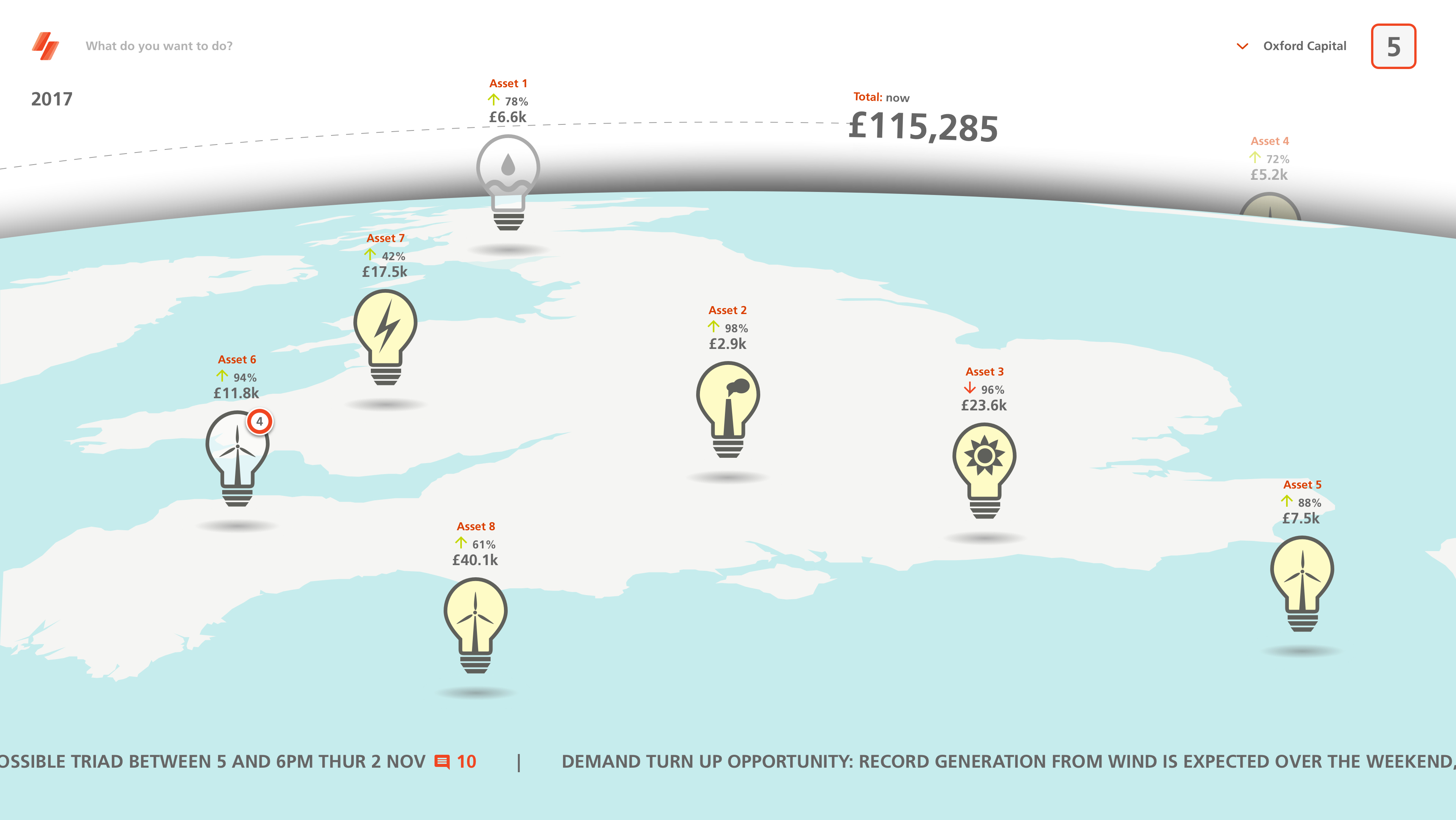
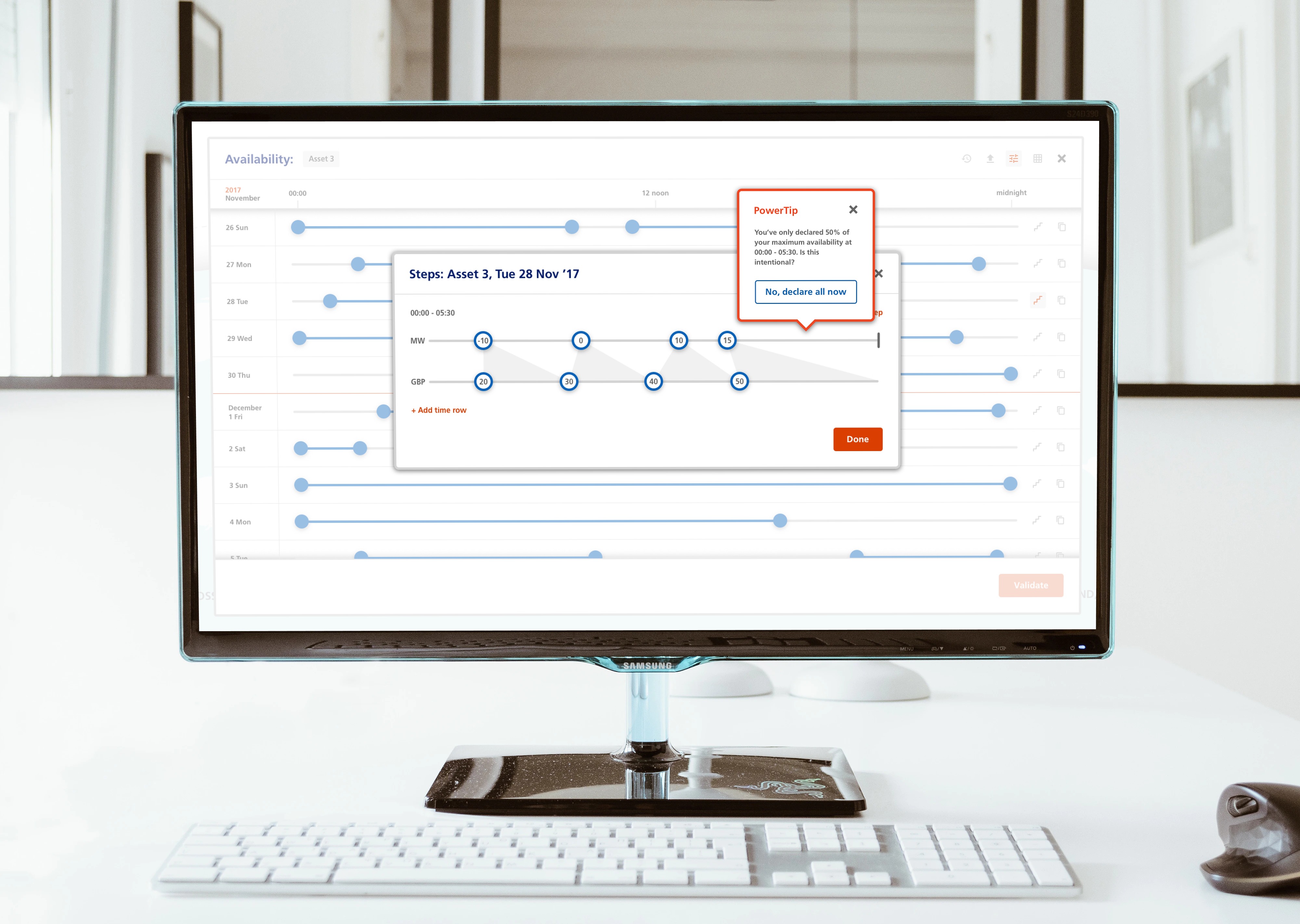
Problem:
EDF was investing in a new way for business and consumers to manage Demand Side Response (DSR). A way for big organisations to efficiently supply energy stored in batteries back to the grid. Eventually, consumers could trade their own stored electricity back to the grid in an app that will automate when to buy and sell their electricity.
Solution:
Working with the EDF innovation and consultants from Amazon, we researched and defined the user types. Those users were interviewed and included in workshops to define what the product needs to be and how it needs to work. We developed our own accelerated design process which was a variant of the double-diamond famously used by Google.
Problem:
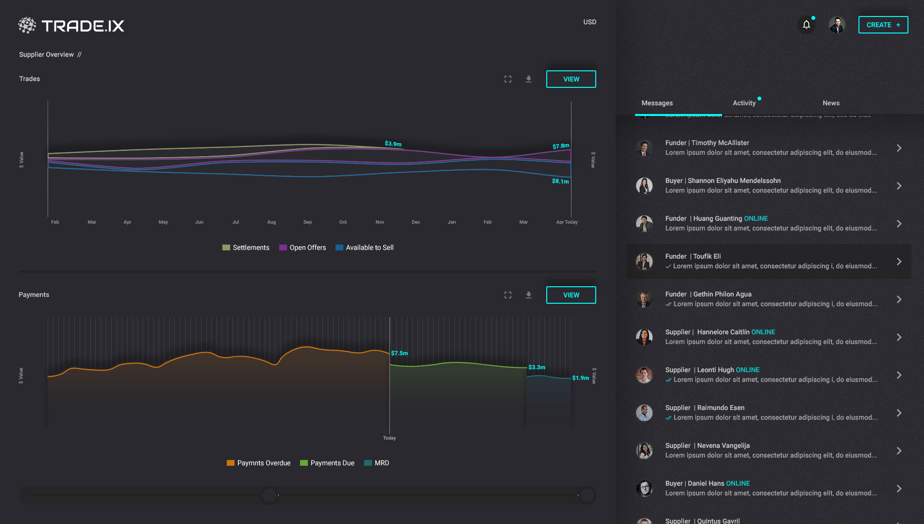
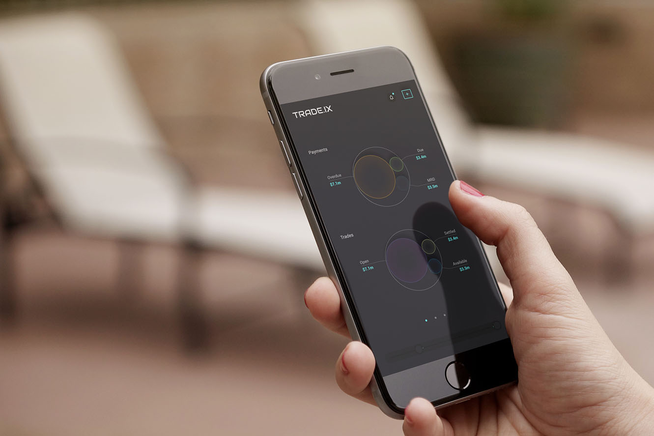
Whenever an entity enters into a new trading network they need to be onboarded, this is a process that takes weeks and is frustrating for all parties as it takes up a lot of resources. Even for the newly onboarded entity, they have to go through weeks of training up and changing their business as a whole to adapt.
Solution:
To be more like PayPal and ebay. There will be onboarding, but it will be quick and easy. In terms of training to use the new system, the Trade.IX moto was "if they have to open a help file we have failed", so I redesigned every user journey and interaction so everything was easily accessible and predictable, stripping away lots of inefficiencies.
I created a system that gave each user powerful data visualisations of contributions and opportunities, even showing available invoice sizes over time and by using a modified Edward Tufte slopegraph, I linked each available invoice to a scale showing tenor length - seeing a big dot along the top x-axis (invoice size) linked to a dot of at the bottom x-axis towards to right (tenor length) would be of great interest to anyone trading invoices on the system. The idea was for users to see the shapes to understand the data instead of having to read and process it which would take longer.

Problem:
As someone who is hands-on involved with the product prior to anything being built, right up to the execution of the final solution into the browser itself, I am aware of how expensive it can become if your development teams don't have a framework of HTML components to take from to use on the front end. Not only do companies end up with seven different dev teams all trying to create the same components, but they also spend their entire design budget on someone like myself finishing the same thing off seven times. If the time had been taken to create the framework at the beginning, I would only have to finish the design patterns off once, and the dev teams would not have to work on the front end at all.
Solution:
Designed and built a new set of extensible, efficient and responsive big data components for EYC's dev teams to share across EYC product suit. Saving this time not only speeds up development which saves lots of time and money, but also can make the company more money, as the dev teams and designers now have the time to innovate, and the sales teams will be able to demo and sell the products to clients much sooner.
Feedback by Arie Lakeman, UI Developer Lead:
"...working with Richard in his capacity as a UX designer I was pleased to observe firstly his appetite to uphold strongly the consistency of the product as a whole, secondly to retain the simplicity of the experience for the end-user, and finally to provide extremely clear requirements to myself as a developer. Richard has very high UX standards and after a process of exploratory discussion is able to lead as the product is worked on. As a designer Richard provides high quality and detailed work, always keeping overall UX in mind. What particularly stood out working with Richard was his awareness of the current best practices in his field, including the views of experts; he is also very mindful of minimising the total number of interactions of the user and the usefulness of A/B testing."
Problem:
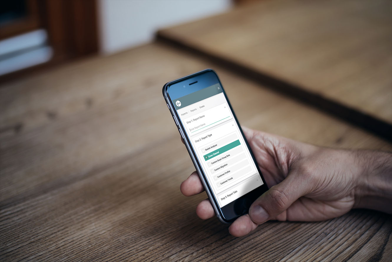
Redesign Aspects application and components so it worked in all browsers and viewports, from working in only IE7 and on only desktop devices.
Solution:
I removed lots of inefficiencies throughout the interactions, for example, on the old version of Aspects users had to open a select dropdown and select an option to select a year, and then open another to select a week. I removed the select boxes and instead used responsive unordered lists, resulting in a 'from-to' date selection pattern taking only three clicks and one scroll, instead of eight clicks and fours scrolls which greatly sped up the creation of reports as this was an interaction user's would do multiple times with every use of the product. I also added a floating selections panel to the right column allowing users to easily scan, navigate to and edit form steps.
Feedback by Frantisek Skorunka, Developer Lead:
"...Richard is an exceptional designer with strong CSS and HTML knowledge. He can translate customer requirements into high standard HTML code which can be easily picked up by the developer. After only a few weeks working together, we had created a mobile-first prototype."
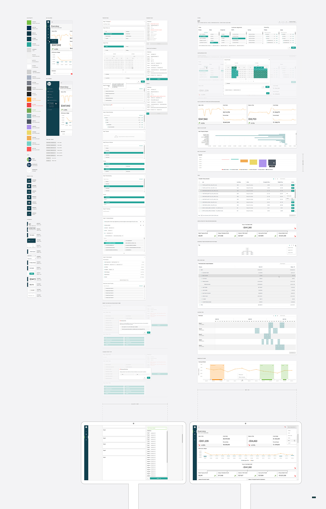
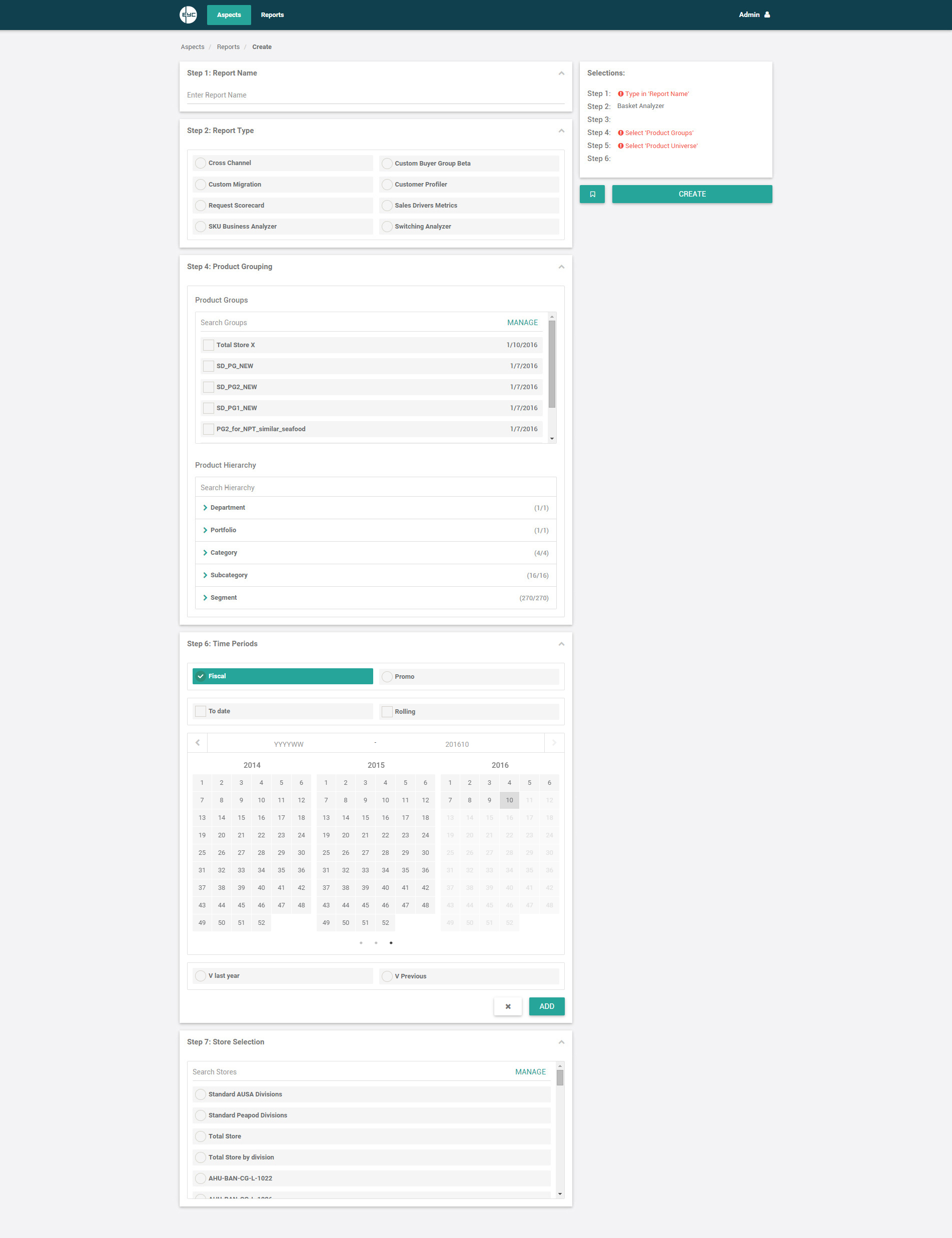
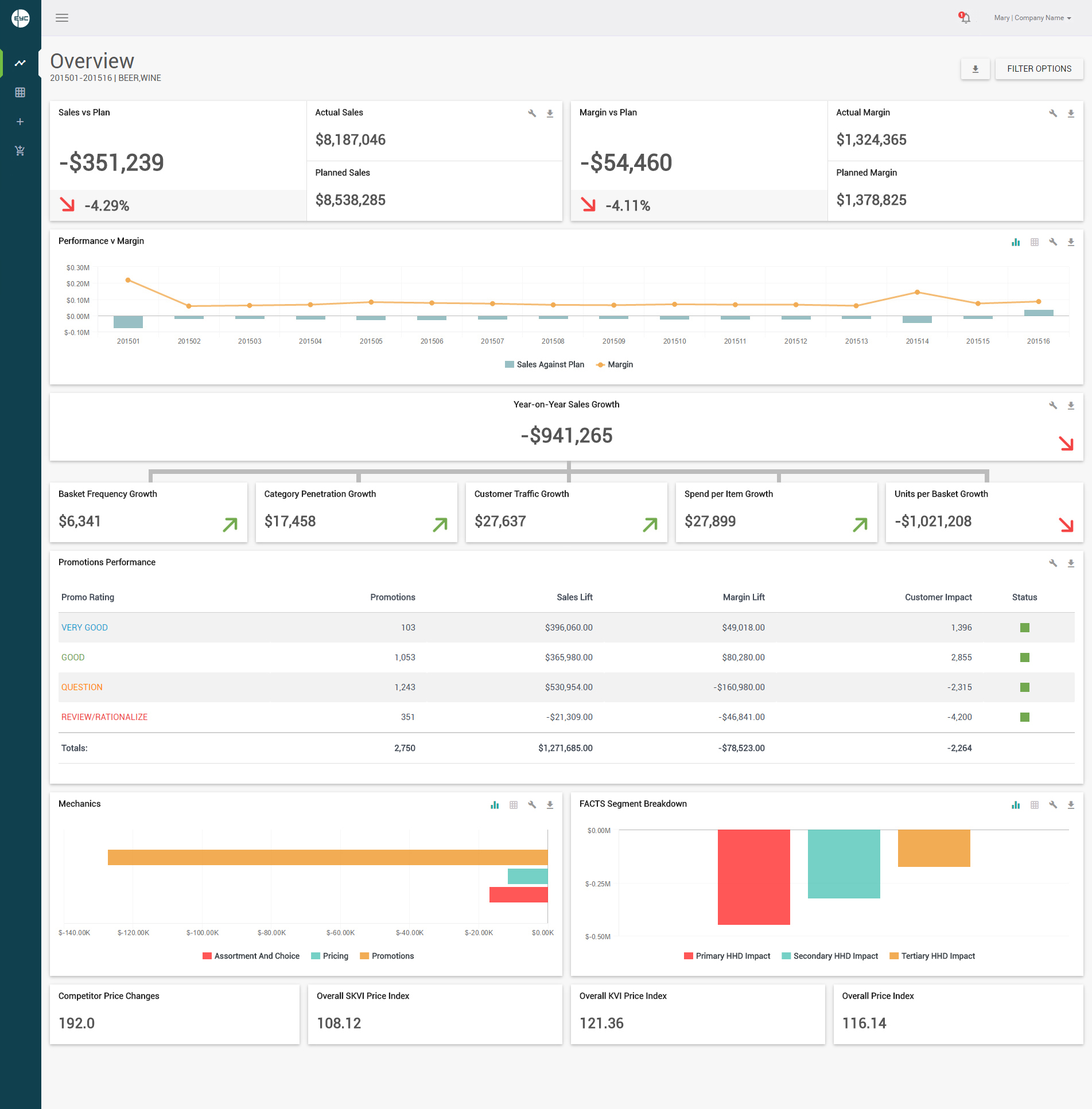
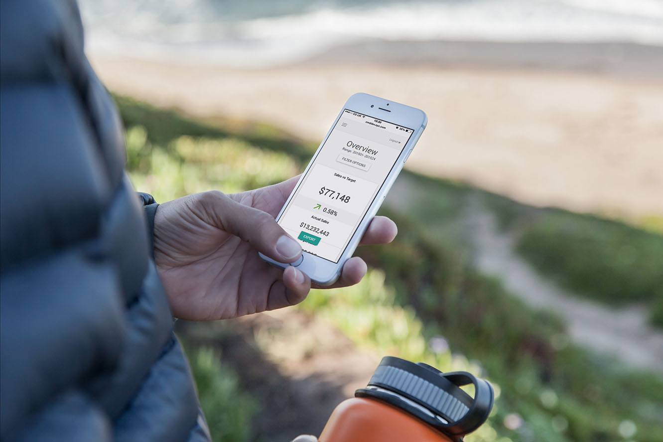
Problem:
Retailers store trillions of line items of transactional data each year, which Category Managers then need to be able to gain insight from easily, quickly and on any device. Currently, all the data they need to action and report is available to them from multiple applications and sources which takes a long time to access and is very complicated to understand.
Solution:
To create a single product containing all the data Category Managers needed that clearly showed what the problems were, where the problems were coming from and what they could do to fix them. I first worked with the analysts who had an Excel-based product I used to create the first wireframes and mock-ups. I then validated and refined the wireframes across more analysts, client teams, sales teams and senior management. From this, I was able to develop a working POC using mostly real data which was then used to sell the product. Lastly, I worked with seven different development teams around the world to productionise the suite. The product could have been improved by: (1) Adding the guided analytics I had designed (CTA-lead) that would work similarly to the top of the Experian dashboards which show number of errors to 'Fix Now' (telling users what the problems are and what action they need to take to fix them); (2) Removing the page scroll by creating widgets containing the insights that each have their own scrollbar; (3) Adding natural language querying similar to ThoughtSpot.
Feedback by Myles Anderson, Product Lead:
"...from conversations around an Excel document to sketches up on the wall, straight into a complex, data-driven, responsive dashboard prototype in just 2 weeks. Richard gets to the heart of the problem and gets seriously good concepts in front of the users at a staggering speed."
Problem:
A big turn off for energy traders when migrating over to new software is having to invest the time in the training room. Even when they are trained they then need the data and answers extremely quickly. The goal was to ensure every time a user performs an action, that action will always be the most efficient route to the user completing that action, and that all interactions and journeys will be predictable and not need to be taught.
Solution:
After carrying out initial cognitive walkthroughs and timing all the important and most used interactions on competitive apps, I designed the information architecture for DATAiQ around this competitor analysis (along with continual internal heuristic evaluation). The solution I designed for DataGenic was the easiest and fastest user experience on the market, making it the first of its kind to not need any kind of training or documentation for it to be used by the new user.
Feedback by Richard Quigley, CEO:
"...Richard researched competition and understood our requirements thoroughly, designing a simple yet extensive user experience, creating all visuals and helping to build and develop a product that will be used as our analytical front end to Genic DataManager - our flagship product."
copyright © Richard Heale